
Displays the values of a status metric with the amount of time spent in each status for a given period.
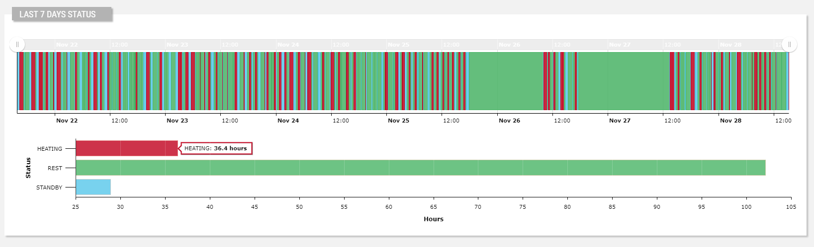
The widget is subdivided into two charts:
- The top one shows the status of the thing instant by instant within the selected period (default last 7 days).
- The bottom one shows the total time the thing spent in each status, with also the relative percentage.
The bottom chart can be a Bar chart (default) or, optionally, a Pie chart, as below.
Each state is displayed using a specific color; by default colors are already configured for the most commonly used states. In addition, you can register other colors for your states, for more details about how to do that, refer to the Colors component article.
code_blocksDesign View
In the template editor, you can find the Status Diagram icon 
You can drag the widget into the grid and then configure the following sub-elements according to your needs:

Below are references to the properties that can be configured for this widget.
For more details on how to manage metrics, you can refer to this article.
code_blocksCode View
Template Syntax
Below you can find some examples of how to use the component within a template.
<div class="d-flex flex-wrap components-row">

    <status-diagram-widget
                [inputs]="{'period': 'period'}"
                [config]="{'statuses': 'OFFLINE|STANDBY|WARMUP|READY|COOKING|FAILURE'}">

            <metric name="Status"></metric>

    </status-diagram-widget>

</div>
Component Reference
Here is a comprehensive list of all the elements and properties that can be used to configure the component.
| Status Diagram <status-diagram-widget> | |
|---|---|
| PROPERTIES | |
| Aggregation Chart Type | The type of the chart displaying the total time spent by status (Bar or Pie). Type: ENUM | Optional | Values: BAR
PIE
[config]="{aggregationChartType: 'PIE'}" |
| CSS Class | The name(s) of the CSS class used to customize the widget layout. Type: STRING | Optional class="my-custom-class" |
| Default Loading Period | The default date and time filtering period applied when entering the page. Type: ENUM | Optional | Values: TODAY
YESTERDAY
LAST_1_HOUR
LAST_6_HOURS
LAST_12_HOURS
LAST_24_HOURS
LAST_7_DAYS
LAST_30_DAYS
THIS_MONTH
LAST_MONTH
LAST_6_MONTHS
LAST_12_MONTHS
THIS_WEEK
LAST_WEEK
LAST_FULL_7_DAYS
LAST_FULL_30_DAYS
LAST_FULL_12_MONTHS
[config]="{defaultPeriod: 'LAST_7_DAYS'}" |
| Export Enabled | The boolean flag indicating whether the data export is enabled. Type: BOOLEAN | Optional | Values: true
false
[config]="{exportEnabled: true}" |
| Include Connection Status | Indicates whether the connection status must be included in the status list. Type: BOOLEAN | Optional | Values: true
false
[config]="{loadConnectionStatus: true}" |
| Period Filter Enabled | The boolean flag indicating whether the embedded period filter is available. Type: BOOLEAN | Optional | Values: true
false
[config]="{filterEnabled: true}" |
| Period Variable | The id of the page's variable providing the date range filtering period, for instance the id of a <period-filter-field>. Type: STRING | Optional [inputs]="{period: 'period'}" |
| Query | The query used to load events. Type: QUERY | Optional [config]="{eventQuery: 'QUERY'}" |
| Show Aggregation Chart | Flag indicating whether to show the aggregation chart. Type: BOOLEAN | Optional | Values: true
false
[config]="{showAggregatedChart: true}" |
| Show events | Flag indicating whether to enable events on charts. Type: BOOLEAN | Optional | Values: true
false
[config]="{showEventsOnChart: false}" |
| Statuses | The comma separated list of all known statuses, if not specified only the retrieved metric values will be displayed (e.g. READY,WORKING). Type: STRING | Optional [config]="{statuses: 'fooBar'}" |
| Title | The title displayed on the top part of the widget box. Type: STRING | Optional [title]="'Details'" |
| Visibility Condition | The expression that allows you to reduce the visibility of the element. Type: STRING | Optional *ngIf="getUser().organizationId != null" |
| End Date Variable | The <period-field>'s End Variable filtering data by end date. Type: STRING | Optional endDateFieldRef="toDate" [DEPRECATED] Use the Period Variable property.
|
| Start Date Variable | The <period-field>'s Start Variable filtering data by start date. Type: STRING | Optional startDateFieldRef="fromDate" [DEPRECATED] Use the Period Variable property instead.
|
| SUB-ELEMENTS | |
| Metric | The metric providing the statuses to display into the widget. Single | Required <metric name="Temperature"></metric> |
| Metric <metric> | |
|---|---|
| PROPERTIES | |
| Filter | The name of the filter used to transform and display values. Type: FILTER | Optional filter="fooBarFilter" |
| Label | The metric alternative label. Type: STRING | Optional label="Temperature" |
| Name | The metric whose value(s) must be loaded by the widget. Type: METRIC | Required name="Temperature" |
Comments
0 comments
Please sign in to leave a comment.