
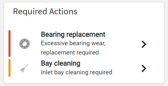
Displays the list of actions grouped by action type, and visible by the user and navigation context.
code_blocksDesign View
In the template editor, you can find the Action Group List icon 
code_blocksCode View
Template Syntax
Below you can find some examples of how to use the component within a template.
<action-group-list-widget [title]="'Actions'">

</action-group-list-widget>
Component Reference
Here is a comprehensive list of all the elements and properties that can be used to configure the component.
| Action Group List <action-group-list-widget> | |
|---|---|
| PROPERTIES | |
| CSS Class | The name(s) of the CSS class used to customize the widget layout. Type: STRING | Optional class="my-custom-class" |
| Status | The statuses of the actions to load. Type: ENUM_ARRAY | Optional | Values: TODO DISCARDED DONE [status]="['V1', 'V2', 'VN']" |
| Title | The title displayed on the top part of the widget box. Type: STRING | Optional [title]="'Details'" |
| Topic | The topics of the actions to load. Type: STRING | Optional topic="fooBar" |
| Type | The types of the actions to load. Type: STRING_ARRAY | Optional type="STRING_ARRAY" |
| Visibility Condition | The expression that allows you to reduce the visibility of the element. Type: STRING | Optional *ngIf="getUser().organizationId != null" |
Comments
0 comments
Please sign in to leave a comment.