
Displays metric or statistic data through columns in a bar chart.
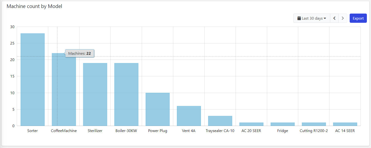
Compared with the time-series widget, this chart uses a category based X-axis, so you must use this widget to load aggregated data and compare values.
Configuration
code_blocksDesign View
In the template editor, you can find the Bar Chart icon 
You can drag the widget into the grid and then configure the following sub-elements according to your needs:

Below are references to the properties that can be configured for this widget.
For more details on how to manage statistics, you can refer to this article.

Below are references to the properties that can be configured for this widget.
For more details on how to manage metrics, you can refer to this article.

Below are references to the properties that can be configured for this widget.
code_blocksCode View
Template Syntax
Below you can find some examples of how to use the component within a template.
<bar-chart-widget-v2 title="Alert Count">
   <statistic resource="alert" aggregation="COUNT" groupBy="MONTH"></statistic>
</bar-chart-widget-v2>
Component Reference
Here is a comprehensive list of all the elements and properties that can be used to configure the component.
| Bar Chart <bar-chart-widget-v2> | |
|---|---|
| PROPERTIES | |
| Collapse / Expand | The flag indicating whether the widget is collaspible. Type: BOOLEAN | Optional | Values: true
false
[collapsible]="true" |
| CSS Class | The name(s) of the CSS class used to customize the widget layout. Type: STRING | Optional class="my-custom-class" |
| Default Loading Period | The default date and time filtering period applied when entering the page. Type: ENUM | Optional | Values: TODAY
YESTERDAY
LAST_1_HOUR
LAST_6_HOURS
LAST_12_HOURS
LAST_24_HOURS
LAST_7_DAYS
LAST_30_DAYS
THIS_MONTH
LAST_MONTH
LAST_6_MONTHS
LAST_12_MONTHS
THIS_WEEK
LAST_WEEK
LAST_FULL_7_DAYS
LAST_FULL_30_DAYS
LAST_FULL_12_MONTHS
[config]="{defaultPeriod: 'LAST_7_DAYS'}" |
| Empty Message | The blank message to be displayed in the widget in case no item was found. To manage translations, you can define a label and use the key as the value of the property. Type: STRING | Optional [config]="{emptyMessage: 'No customer found'}" |
| Enabled Periods | The list of periods which can be selected from the embedded period filter. Type: ENUM_ARRAY | Optional | Values: TODAY
YESTERDAY
LAST_1_HOUR
LAST_6_HOURS
LAST_12_HOURS
LAST_24_HOURS
LAST_7_DAYS
LAST_30_DAYS
THIS_MONTH
LAST_MONTH
LAST_6_MONTHS
LAST_12_MONTHS
THIS_WEEK
LAST_WEEK
LAST_FULL_7_DAYS
LAST_FULL_30_DAYS
LAST_FULL_12_MONTHS
CUSTOM
[config]="{enabledPeriods: ['V1', 'V2', 'VN']}" |
| Export Enabled | The boolean flag indicating whether the data export is enabled. Type: BOOLEAN | Optional | Values: true
false
[config]="{exportEnabled: true}" |
| Height | The height of the widget (e.g. 250px). Type: STRING | Optional [config]="{height: '250px'}" |
| Mode | The mode used to display the chart. WIDE: Controls, axis and grid are displayed. MICRO: Just bars are displayed ina small box. Type: ENUM | Optional | Values: WIDE
MICRO
[config]="{mode: 'MICRO'}" |
| Period Filter Enabled | The boolean flag indicating whether the embedded period filter is available. Type: BOOLEAN | Optional | Values: true
false
[config]="{filterEnabled: true}" |
| Period Variable | The id of the page's variable providing the date range filtering period, for instance the id of a <period-filter-field>. Type: STRING | Optional [inputs]="{period: 'period'}" |
| Query Variable | The id of the page's <things-filter-field> used for searching. Type: STRING | Optional [inputs]="{query: 'query-1'}" |
| Show Bars Horizontally | The flag indicating whether to display the bars horizontally. Type: BOOLEAN | Optional | Values: true
false
[config]="{rotate: true}" |
| Show Category Labels | Show category under each single bar. Type: BOOLEAN | Optional | Values: true
false
[config]="{showBarCategories: true}" |
| Show Pareto Line | Compute the cumulative total and display it through a line overlaid on the columns. Type: BOOLEAN | Optional | Values: true
false
[config]="{showParetoLine: true}" |
| Title | The title displayed on the top part of the widget box. Type: STRING | Optional [title]="'Details'" |
| Width | The width of the widget (e.g. 500px). Type: STRING | Optional [config]="{width: '500px'}" |
| X-Axis Label | The label to be displayed under the X-axis. Type: STRING | Optional [config]="{xAxisLabel: 'Alerts by type'}" |
| Y-Axis Label | The label to be displayed on the left of the Y-axis. Type: STRING | Optional [config]="{yAxisLabel: 'Count'}" |
| SUB-ELEMENTS | |
| Statistic | The statistic whose values must be rendered as chart columns. Single | Required <statistic resource="ALERT"></statistic> |
| Metric | The metric whose values must be aggregated and rendered as chart columns. Multiple | Required <metric name="Temperature"></metric> |
| Aggregated Value | The aggregated value to be displayed over the Bar Chart. Multiple | Optional <property label="Total" [config]="{unit: 'hours'}"></property> |
| Statistic <statistic> | |
|---|---|
| PROPERTIES | |
| Aggregation | The function used to aggregate data. Type: ENUM | Optional | Values: AVG
COUNT
MAX
MIN
SUM
aggregation="MAX" |
| Alert Status | Define whether to include alerts that are still active, or have been activated in a period. Type: ENUM | Optional | Values: ACTIVE
ACTIVATED
activationType="ACTIVATED" |
| Averaged By | The count used to average the statistic results (e.g. Average alert count by thing). Type: ENUM | Optional | Values: thingCount averagedBy="thingCount" |
| Color | The color used to render columns. Type: STRING | Optional [config]="{color: 'fooBar'}" |
| Group By | The property used to group results. For instance: customer.country. In the case where the underlying objects are temporally distributed you can also aggregate by HOUR, DAY, MONTH and YEAR. Type: GROUP_BY | Optional groupBy="customer.name" |
| Label | The alternative label displayed by the widget. Type: STRING | Optional label="Temperature" |
| Max Result Count | The number of maximum returned results (default all results are returned). Type: INTEGER | Optional [limit]="123" |
| Property | The object property whose values must be aggregated. Type: PROPERTY | Optional property="PROPERTY" |
| Query | The array of conditions filtering out items. For instance: [query]='[{'property': 'connectionStatus', 'predicate': 'eq', 'value': '1'}]' Predicates: eq, beginsWith, like, notLike, isEmpty, isNotEmpty, gt, gte, lt, lte. Type: QUERY | Optional query="[{'property': 'connectionStatus', 'predicate': 'eq', 'value': '1'}, {...}]" |
| Resource | The resource from which to retrieve the items to be used to calculate the statistic. Type: ENUM | Required | Values: ACTION
ALERT
CUSTOMER
LOCATION
PARTNER
THING
USER
WORK_SESSION
resource="ALERT" |
| Sorting | The sort direction used to order categories by value (default none). Type: ENUM | Optional | Values: ASC
DESC
sortDirection="DESC" |
| Unit | The unit of measurement to be displayed along the value. Type: STRING | Optional [config]="{unit: '°C'}" |
| Value Filter | The name of the filter used to transform and display values. Type: FILTER | Optional filter="fooBarFilter" |
| Category Order | The order used to display categories by value in the chart. Type: ENUM | Optional | Values: ASC
DESC
[config]="{categoryOrder: 'DESC'}" [DEPRECATED] Use the Sorting property.
|
| Metric <metric> | |
|---|---|
| PROPERTIES | |
| Aggegation | The aggregation applied on the metric values. Type: ENUM | Optional | Values: AVG
DELTA
MAX
MIN
SUM
[config]="{aggregation: 'SUM'}" |
| Category Order | The order used to display categories by value in the chart. Type: ENUM | Optional | Values: ASC
DESC
[config]="{categoryOrder: 'DESC'}" |
| Color | The color used to render columns. Type: STRING | Optional [config]="{color: 'fooBar'}" |
| Group By | The group by applied on the metric values. Type: ENUM | Optional | Values: DAY_OF_MONTH
HOUR_OF_DAY
[config]="{groupBy: 'HOUR_OF_DAY'}" |
| Label | The alternative label displayed by the widget. Type: STRING | Optional label="Temperature" |
| Name | The metric whose value(s) must be loaded by the widget. Type: METRIC | Required name="Temperature" |
| Unit | The unit of measurement to be displayed along the value. Type: STRING | Optional unit="°C" |
| Value Filter | The name of the filter used to transform and display values. Type: FILTER | Optional filter="fooBarFilter" |
| Aggregated Value <property> | |
|---|---|
| PROPERTIES | |
| Aggregation | The aggregation type. Type: ENUM | Optional | Values: AVG
MAX
MIN
SUM
[config]="{aggregation: 'MAX'}" |
| Filter | The name of the filter used to transform and display values. Type: FILTER | Optional filter="fooBarFilter" |
| Label | The label displayed for the aggregated value. Type: STRING | Optional label="Temperature" |
| Unit | The unit of measurement to be displayed along the value. Type: STRING | Optional [config]="{unit: '°C'}" |
Comments
0 comments
Please sign in to leave a comment.