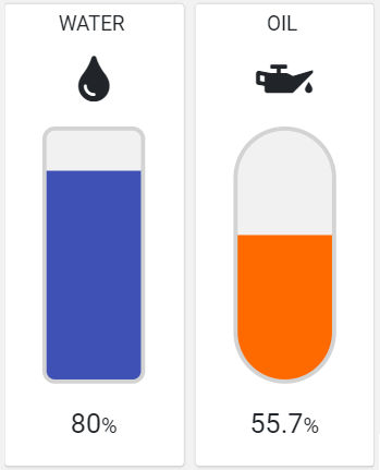
A widget that displays the level of a stackable quantity in a shaped tank.

The widget requires specifying the metric providing the level percentage (0% - 100%), optionally you can display the title, icon, and percentage value, and also according to other configuration properties, you can change colors and tank shape.
Configuration
code_blocksDesign View
In the template editor, you can find the Level Indicator icon 
You can drag the widget into the grid and then configure the following sub-elements according to your needs:

Below are references to the properties that can be configured for this widget.
For more details on how to manage metrics, you can refer to this article.
code_blocksCode View
Template Syntax
Below you can find some examples of how to use the component within a template.
<level-indicator-widget [config]="{icon: 'fas fa-oil-can', tankShape: 'PILL'}">
	<metric name="Oil Level"></metric>
</level-indicator-widget>
Component Reference
Here is a comprehensive list of all the elements and properties that can be used to configure the component.
| Level Indicator <level-indicator-widget> | |
|---|---|
| PROPERTIES | |
| CSS Class | The name(s) of the CSS class used to customize the widget layout. Type: STRING | Optional class="my-custom-class" |
| Empty Color | The color used as background for the empty tank part. Type: STRING | Optional | Default: #F1F1F1 [config]="{emptyColor: 'fooBar'}" |
| Fill Color | The color used as background by the level bar. Type: STRING | Optional | Default: #FF6A00 [config]="{fillColor: 'fooBar'}" |
| Icon | The name of the Font Awesome icon. Type: STRING | Optional [config]="{icon: 'fas fa-thermometer-quarter'}" |
| Show Percentage | Indicates whether the percentage value must be displayed below the level indicator. Type: BOOLEAN | Optional | Values: true
false
[config]="{showPercentage: true}" |
| Stroke Color | The color used as tank stroke. Type: STRING | Optional | Default: #D3D3D3 [config]="{strokeColor: 'fooBar'}" |
| Tank Height | The height in px of the tank. Type: INTEGER | Optional | Default: 250 [config]="{tankHeight: 123}" |
| Tank Shape | The shape of the tank overlaid on the level bar. Type: ENUM | Optional | Values: ROUNDED_RECT
PILL
[config]="{tankShape: 'PILL'}" |
| Tank Width | The Width in px of the tank. Type: INTEGER | Optional | Default: 94 [config]="{tankWidth: 123}" |
| Title | The title displayed on the top part of the widget box. Type: STRING | Optional [title]="'Details'" |
| Visibility Condition | The expression that allows you to reduce the visibility of the element. Type: STRING | Optional *ngIf="getUser().organizationId != null" |
| SUB-ELEMENTS | |
| Metric | The metric used by the widget to display the level. Multiple | Required <metric name="Temperature"></metric> |
| Metric <metric> | |
|---|---|
| PROPERTIES | |
| Filter | The name of the filter used to transform and display values. Type: FILTER | Optional filter="fooBarFilter" |
| Label | The metric alternative label. Type: STRING | Optional label="Temperature" |
| Name | The metric whose value(s) must be loaded by the widget. Type: METRIC | Required name="Temperature" |
| Unit | The unit of measurement to be displayed along the value. Type: STRING | Optional unit="°C" |
| Visibility Condition | The expression that allows you to reduce the visibility of the element. Type: STRING | Optional *ngIf="getUser().organizationId != null" |

Comments
0 comments
Please sign in to leave a comment.