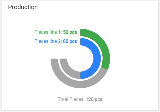
This widget displays partial and total metric values in a concentric donuts grap

The widget requires the definition of at least two metrics, the last of which is always used as a total, while the previous ones are used as partials. For each partial metric, a colored strip is displayed with a length as a percentage of the total value. In case there are only two metrics (one partial and one total), the percentage can be displayed also in the middle of the diagram.
code_blocksDesign View
In the template editor, you can find the Solid Gauge icon 
You can drag the widget into the grid and then configure the following sub-elements according to your needs:

Below are references to the properties that can be configured for this widget.
For more details on how to manage metrics, you can refer to this article.
code_blocksCode View
Template Syntax
Below you can find some examples of how to use the component within a template.
<solid-gauge-widget [title]="'Production'">
     <metric name="piecesline1" label="Pieces line 1"></metric>
     <metric name="piecesline2" label="Pieces line 1"></metric>
     <metric name="totalPieces" label="Total Pieces"></metric>
</solid-gauge-widget>
Component Reference
Here is a comprehensive list of all the elements and properties that can be used to configure the component.
| Solid Gauge <solid-gauge-widget> | |
|---|---|
| PROPERTIES | |
| CSS Class | The name(s) of the CSS class used to customize the widget layout. Type: STRING | Optional class="my-custom-class" |
| Show Percentage | The flag indicating whether to display the percentage respect to the total value. Type: BOOLEAN | Optional | Values: true
false
[config]="{showPercentage: true}" |
| Title | The title displayed on the top part of the widget box. Type: STRING | Optional [title]="'Details'" |
| Total Color | The color used for the total label and the stripe background. Type: STRING | Optional | Default: #9C9C9C [config]="{totalColor: '#AABBCC'}" |
| Unit | The default unit of measurement if missing for the metric. Type: STRING | Optional [config]="{unit: '°C'}" |
| Visibility Condition | The expression that allows you to reduce the visibility of the element. Type: STRING | Optional *ngIf="getUser().organizationId != null" |
| SUB-ELEMENTS | |
| Metric | The metric whose value must be displayed as gauge stripe. Multiple | Required <metric name="Temperature"></metric> |
| Metric <metric> | |
|---|---|
| PROPERTIES | |
| Color | The color used for the partial label and the stripe foreground. Type: STRING | Optional [chartOptions]="{color: '#007BFF'}" |
| Filter | The name of the filter used to transform and display values. Type: FILTER | Optional filter="fooBarFilter" |
| Label | The metric alternative label. Type: STRING | Optional label="Temperature" |
| Name | The metric whose value(s) must be loaded by the widget. Type: METRIC | Required name="Temperature" |
| Unit | The unit of measurement to be displayed along the value. Type: STRING | Optional unit="°C" |
| Visibility Condition | The expression that allows you to reduce the visibility of the element. Type: STRING | Optional *ngIf="getUser().organizationId != null" |

Comments
0 comments
Please sign in to leave a comment.