
This widget displays a metrics values into a scatter chart. This widget displays XY points where X and Y are the values of the two input metrics and the value pairs are obtained by matching data points by timestamp.
You can also display lines between data points, and coloring the area between the line and the X or Y axis. Here is an example showing the progression of a drilling combining the Depth and RPM.
code_blocksDesign View
In the template editor, you can find the Scatter Chart icon 
You can drag the widget into the grid and then configure the following sub-elements according to your needs:

Below are references to the properties that can be configured for this widget.
For more details on how to manage metrics, you can refer to this article.
code_blocksCode View
Template Syntax
Below you can find some examples of how to use the component within a template.
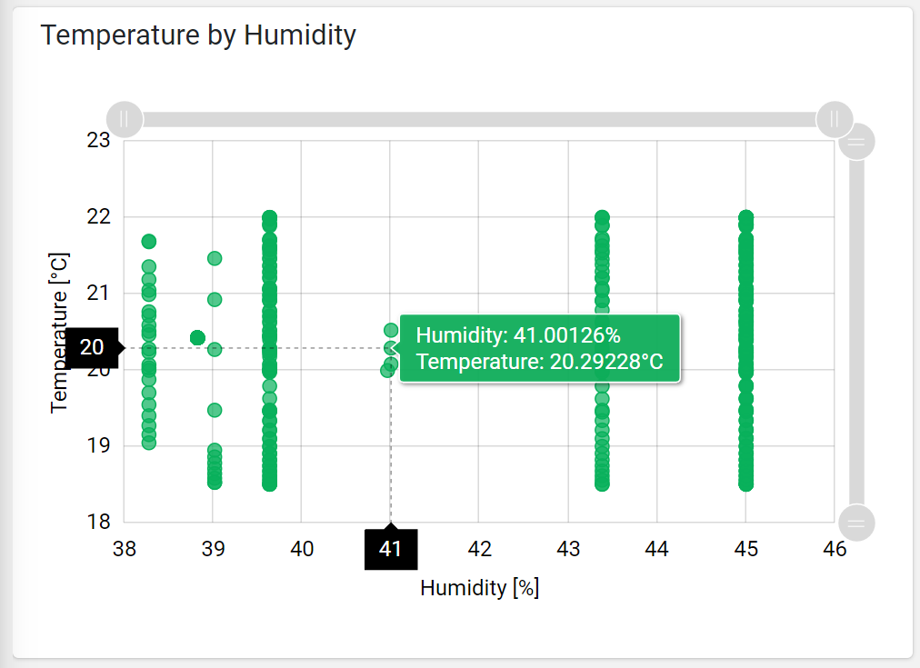
<scatter-chart-widget [title]="'Temperature by Humidity'">
  <metric name="humidity"></metric>
  <metric name="temperature"></metric>
</scatter-chart-widget>
Component Reference
Here is a comprehensive list of all the elements and properties that can be used to configure the component.
| Scatter Chart <scatter-chart-widget> | |
|---|---|
| PROPERTIES | |
| Color | The color used to display the bullets and lines. Type: STRING | Optional | Default: #08B05B [config]="{color: 'fooBar'}" |
| CSS Class | The name(s) of the CSS class used to customize the widget layout. Type: STRING | Optional class="my-custom-class" |
| Default Loading Period | The default date and time filtering period applied when entering the page. Type: ENUM | Optional | Values: TODAY
YESTERDAY
LAST_1_HOUR
LAST_6_HOURS
LAST_12_HOURS
LAST_24_HOURS
LAST_7_DAYS
LAST_30_DAYS
THIS_MONTH
LAST_MONTH
LAST_6_MONTHS
LAST_12_MONTHS
THIS_WEEK
LAST_WEEK
LAST_FULL_7_DAYS
LAST_FULL_30_DAYS
LAST_FULL_12_MONTHS
[config]="{defaultPeriodValue: 'LAST_7_DAYS'}" |
| Export Enabled | The boolean flag indicating whether the data export is enabled. Type: BOOLEAN | Optional | Values: true
false
[config]="{exportEnabled: true}" |
| Export File Type | The export file type Type: ENUM | Optional | Values: json
csv
xlsx
[config]="{exportFileType: 'csv'}" |
| Height | The widget desired height (default 480px). Type: STRING | Optional [config]="{height: '250px'}" |
| Period Filter Enabled | The boolean flag indicating whether the embedded period filter is available. Type: BOOLEAN | Optional | Values: true
false
[config]="{filterEnabled: true}" |
| Period Variable | The id of the page's variable providing the date range filtering period, for instance the id of a <period-filter-field>. Type: STRING | Optional [inputs]="{period: 'period'}" |
| Scrollbar Enabled | The flag enabling the widget top scrolbar allowing the user to scroll and zoom data. Type: BOOLEAN | Optional | Values: true
false
[config]="{scrollbarEnabled: true}" |
| Show Bullets | Indicates whether to display data point bullets. Type: BOOLEAN | Optional | Values: true
false
[config]="{showBullets: true}" |
| Show Timestamps | Indicates whether to display the timestamps associated to data points. Type: BOOLEAN | Optional | Values: true
false
[config]="{showTimestamps: true}" |
| Title | The title displayed on the top part of the widget box. Type: STRING | Optional [title]="'Details'" |
| Visibility Condition | The expression that allows you to reduce the visibility of the element. Type: STRING | Optional *ngIf="getUser().organizationId != null" |
| SUB-ELEMENTS | |
| Metric | The X-axis (first) or Y-axis (second) metric whose values must be loaded by the widget. Multiple | Required <metric name="Temperature"></metric> |
| Metric <metric> | |
|---|---|
| PROPERTIES | |
| Filter | The name of the filter used to transform and display values. Type: FILTER | Optional filter="fooBarFilter" |
| Label | The metric alternative label. Type: STRING | Optional label="Temperature" |
| Name | The metric whose value(s) must be loaded by the widget. Type: METRIC | Required name="Temperature" |
| Unit | The unit of measurement to be displayed along the value. Type: STRING | Optional unit="°C" |
| Visibility Condition | The expression that allows you to reduce the visibility of the element. Type: STRING | Optional *ngIf="getUser().organizationId != null" |
Comments
0 comments
Please sign in to leave a comment.