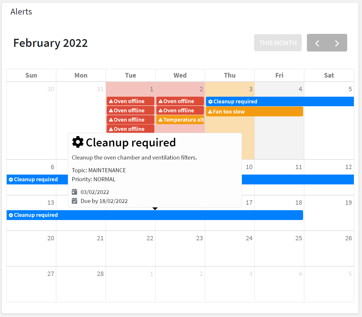
Displays a calendar with alerts, actions, and other relevant events by day.

For each loaded element (e.g. Alerts, Actions), an event is added to the calendar according to the severity or priority, activation date, and end or due date.
When moving on the events with the cursor a tooltip will display additional information (e.g. description).
For an alert-based event, the information tooltip displays:
- the title and description.
- the severity (e.g. CRITICAL) and the category (e.g. ANOMALY).
- the status (ACTIVE or CLEARED).
- the time the alert was triggered and the duration.
For an action-based event, the information tooltip displays:
- the title and description.
- the priority (e.g. HIGH) and the topic (e.g. MAINTENANCE).
- the action status (TODO, DONE, REJECTED).
- the time the action was registered.
- the due date by which the action must be completed.
- the user who has completed or rejected the action.
code_blocksDesign View
In the template editor, you can find the Calendar icon 
code_blocksCode View
Template Syntax
Below you can find some examples of how to use the component within a template.
Example 1
Calendar displaying alerts and actions.
<calendar-widget [title]="'Alerts and Actions'"></calendar-widget>
Example 2
Calendar displaying actions only.
<calendar-widget [title]="'Actions'"
                 [config]="{showAlerts:false}">

</calendar-widget>
Component Reference
Here is a comprehensive list of all the elements and properties that can be used to configure the component.
| Calendar <calendar-widget> | |
|---|---|
| PROPERTIES | |
| CSS Class | The name(s) of the CSS class used to customize the widget layout. Type: STRING | Optional class="my-custom-class" |
| Show Actions | The flag indicating whether actions must be shown into the calendar. Type: BOOLEAN | Optional | Values: true false [config]="{showActions: true}" |
| Show Alerts | The flag indicating whether alerts must be shown into the calendar. Type: BOOLEAN | Optional | Values: true false [config]="{showAlerts: true}" |
| Visibility Condition | The expression that allows you to reduce the visibility of the element. Type: STRING | Optional *ngIf="getUser().organizationId != null" |

Comments
0 comments
Please sign in to leave a comment.