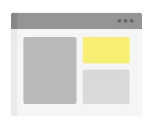
With this widget it is possible to include a model in another model. This makes it possible to create and organize models in a modular way, facilitating code reuse.
For example, with reference to the image below, the content of the yellow box is defined in a specific template and inserted into the main template along with other widgets.

code_blocksDesign View
In the template editor, you can find the Include Template icon 
code_blocksCode View
Template Syntax
Below you can find some examples of how to use the component within a template.
<div class="d-flex flex-wrap components-row">

    <thing-details-widget>
        <property name="serialNumber"></property>
        <property name="connectionStatus"></property>
    </thing-details-widget>

</div>
<div class="d-flex flex-wrap components-row">

    <include-template name="commands-box"></include-template>

</div>
Component Reference
Here is a comprehensive list of all the elements and properties that can be used to configure the component.
| Include Template <include-template> | |
|---|---|
| PROPERTIES | |
| CSS Class | The name(s) of the CSS class used to customize the widget layout. Type: STRING | Optional class="my-custom-class" |
| Template Name | The name of the template to include. Type: STRING | Required name="fooBar" |
| Visibility Condition | The expression that allows you to reduce the visibility of the element. Type: STRING | Optional *ngIf="getUser().organizationId != null" |

Comments
0 comments
Please sign in to leave a comment.