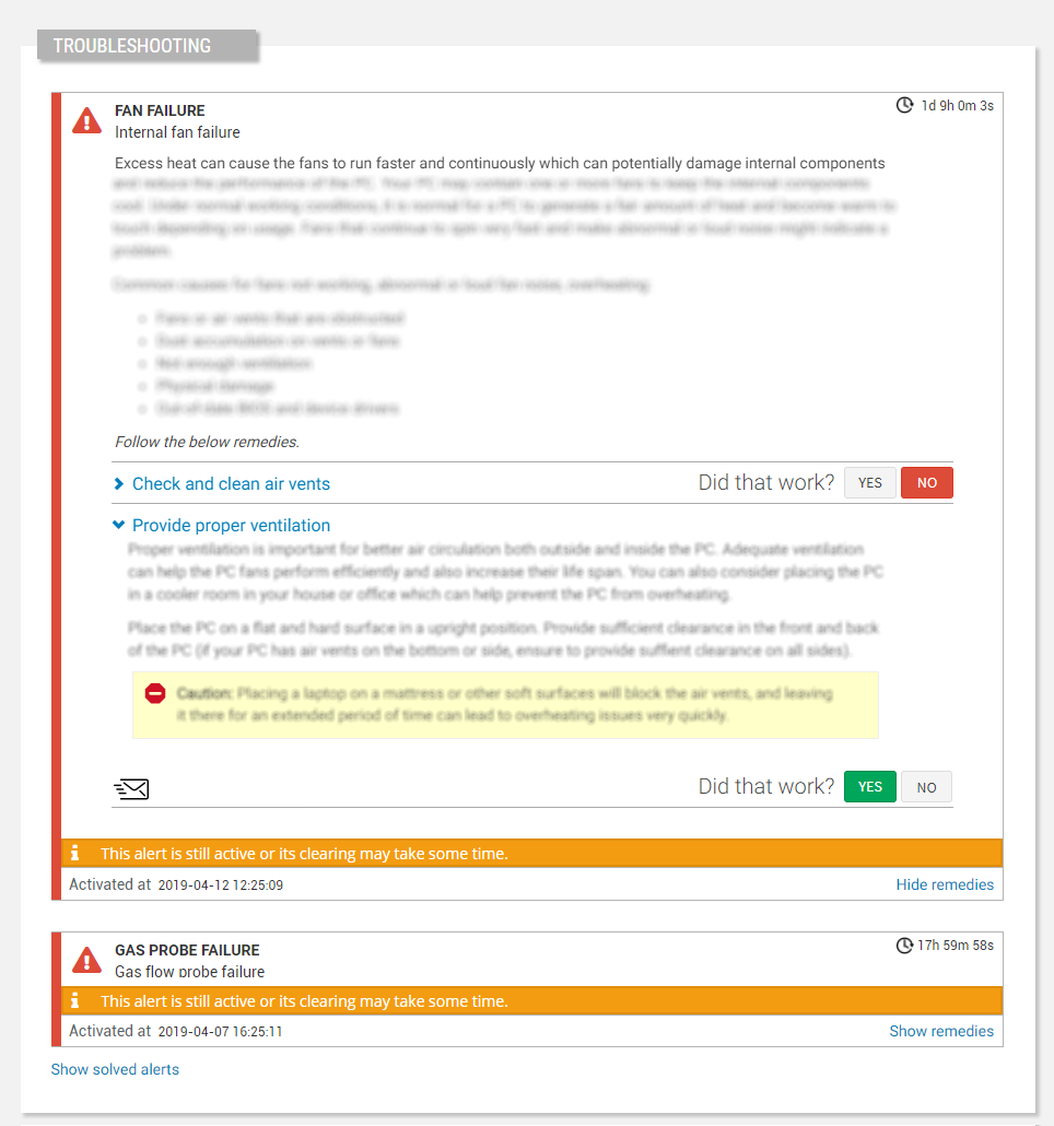
Allows technical users to perform self troubleshooting to resolve active alerts.

Each alert definition allows you to define one or more remedies that the user can put into practice to try to solve the problem by himself.
The Alert Troubleshooting widget allows you to provide the user with what is commonly referred to as an expert system. When an alert is activated, the user will be shown the configured remedies. For each remedy it will be possible to answer whether it successful or not. If yes, the troubleshooting process ends, else the next remedy will be shown.
Each remedy is described by a title and an HTML description which can include images and references to the product documentation.
code_blocksDesign View
In the template editor, you can find the Thing Troubleshooting icon 
code_blocksCode View
Template Syntax
Below you can find some examples of how to use the component within a template.
<thing-troubleshooting-widget [title]="'Alert Troubleshooting'"
                              [loadPeriod]="'PT7D'">
</thing-troubleshooting-widget>
Component Reference
Here is a comprehensive list of all the elements and properties that can be used to configure the component.
| Thing Troubleshooting <thing-troubleshooting-widget> | |
|---|---|
| PROPERTIES | |
| CSS Class | The name(s) of the CSS class used to customize the widget layout. Type: STRING | Optional class="my-custom-class" |
| Load Period | The period of loaded alerts when the page is accessed (e.g. P7D, PT36H). The value is expressed using the ISO 8601 standard. Type: STRING | Optional loadPeriod="fooBar" |
| Title | The title displayed on the top part of the widget box. Type: STRING | Optional [title]="'Details'" |
| Visibility Condition | The expression that allows you to reduce the visibility of the element. Type: STRING | Optional *ngIf="getUser().organizationId != null" |

Comments
0 comments
Please sign in to leave a comment.