
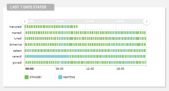
This widget prints out the value transitions of a metric considering the previous 7 days.
code_blocksDesign View
In the template editor, you can find the Yamazumi Diagram icon 
code_blocksCode View
Template Syntax
Below you can find some examples of how to use the component within a template.
<yamazumi-chart title="Last 7 days status"
                metric="Status">
</yamazumi-chart>
Component Reference
Here is a comprehensive list of all the elements and properties that can be used to configure the component.
| Yamazumi Diagram <yamazumi-chart> | |
|---|---|
| PROPERTIES | |
| Color Filter | The filter function used to draw values using a common color palette. Type: FILTER | Optional colorFilter="myColorFilter" |
| Colors | The color palette used by the widget (e.g. ['#00a659', '#d3d3d3']) Type: JSON | Optional [colors]="['#00a659', '#d3d3d3']" |
| Column Width | The size (from 0 to 1) of the segments within the widget (e.g. 0.5). Type: FLOAT | Optional columnWidth="FLOAT" |
| CSS Class | The name(s) of the CSS class used to customize the widget layout. Type: STRING | Optional class="my-custom-class" |
| Graph | The JSON describing how the chart should be displayed, for more details see the AmChart - Charts documentation. Type: JSON | Optional [graph]="{foo: 'bar'}" |
| Height | The height of the widget (e.g. 250px). Type: STRING | Optional height="250px" |
| Name | The metric whose value(s) must be loaded by the widget. Type: METRIC | Required metric="Temperature" |
| Period | The date and time period filtering data. Type: STRING | Optional period="fooBar" |
| Title | The title displayed on the top part of the widget box. Type: STRING | Optional [title]="'Details'" |
| Visibility Condition | The expression that allows you to reduce the visibility of the element. Type: STRING | Optional *ngIf="getUser().organizationId != null" |
| Width | The width of the widget (e.g. 500px). Type: STRING | Optional width="500px" |
Comments
0 comments
Please sign in to leave a comment.