
Displays the values of multiple metrics in a plain list or table with one column per metric.
Values are ordered by the timestamp descending, scrolling the list oldest values will be loaded automatically.
code_blocksDesign View
In the template editor, you can find the Multi Metric List icon 
You can drag the widget into the grid and then configure the following sub-elements according to your needs:

Below are references to the properties that can be configured for this widget.
For more details on how to manage metrics, you can refer to this article.
code_blocksCode View
Template Syntax
Below you can find some examples of how to use the component within a template.
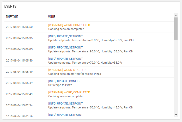
<multi-metric-list-widget title="Events" mode="LOG">
    <metric name="EventInfo" filter="messageWithSeverity"></metric>
</multi-metric-list-widget>
Component Reference
Here is a comprehensive list of all the elements and properties that can be used to configure the component.
| Multi Metric List <multi-metric-list-widget> | |
|---|---|
| PROPERTIES | |
| Collapse / Expand | The flag indicating whether the widget is collaspible. Type: BOOLEAN | Optional | Values: true
false
[collapsible]="true" |
| CSS Class | The name(s) of the CSS class used to customize the widget layout. Type: STRING | Optional class="my-custom-class" |
| Default Loading Period | The default date and time filtering period applied when entering the page. Type: ENUM | Optional | Values: TODAY
YESTERDAY
LAST_1_HOUR
LAST_6_HOURS
LAST_12_HOURS
LAST_24_HOURS
LAST_7_DAYS
LAST_30_DAYS
THIS_MONTH
LAST_MONTH
LAST_6_MONTHS
LAST_12_MONTHS
THIS_WEEK
LAST_WEEK
LAST_FULL_7_DAYS
LAST_FULL_30_DAYS
LAST_FULL_12_MONTHS
defaultPeriodValue="LAST_7_DAYS" |
| Export Enabled | The boolean flag indicating whether the data export is enabled. Type: BOOLEAN | Optional | Values: true
false
[exportEnabled]="true" |
| Page Size | The number of results to load when scrolling down the list. Type: INTEGER | Optional | Default: 20 [pageSize]="123" |
| Period Filter Enabled | The boolean flag indicating whether the embedded period filter is available. Type: BOOLEAN | Optional | Values: true
false
[filterEnabled]="true" |
| Period Variable | The id of the page's variable providing the date range filtering period, for instance the id of a <period-filter-field>. Type: STRING | Optional periodRef="period" |
| Refresh Interval | The interval to check for updates (e.g. P7D, PT36H). The value is expressed using the ISO 8601 standard for durations. Type: STRING | Optional | Default: PT30 refreshInterval="fooBar" |
| Show Timestamp Column | The boolean flag indicating whether the Timestamp column is visible. Type: BOOLEAN | Optional | Values: true
false
[showTimestamp]="true" |
| Title | The title displayed on the top part of the widget box. Type: STRING | Optional [title]="'Details'" |
| Visibility Condition | The expression that allows you to reduce the visibility of the element. Type: STRING | Optional *ngIf="getUser().organizationId != null" |
| End Date Variable | The <period-field>'s End Variable filtering data by end date. Type: STRING | Optional endDateFieldRef="toDate" [DEPRECATED] Use the Period Variable property.
|
| Start Date Variable | The <period-field>'s Start Variable filtering data by start date. Type: STRING | Optional startDateFieldRef="fromDate" [DEPRECATED] Use the Period Variable property instead.
|
| SUB-ELEMENTS | |
| Metric | The metric whose label and current value must be rendered as a widget row. Multiple | Optional <metric name="Temperature"></metric> |
| Metric <metric> | |
|---|---|
| PROPERTIES | |
| Filter | The name of the filter used to transform and display values. Type: FILTER | Multiple value | Optional filter="fooBarFilter" |
| Label | The metric alternative label. Type: STRING | Optional label="Temperature" |
| Name | The metric whose value(s) must be loaded by the widget. Type: METRIC | Required name="Temperature" |
| Unit | The unit of measurement to be displayed along the value. Type: STRING | Optional unit="°C" |
| Visibility Condition | The expression that allows you to reduce the visibility of the element. Type: STRING | Optional *ngIf="getUser().organizationId != null" |
Comments
0 comments
Please sign in to leave a comment.