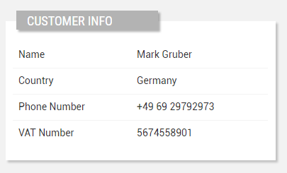
Displays the properties of a customer in a details box.

code_blocksDesign View
In the template editor, you can find the Customer Details icon 
You can drag the widget into the grid and then configure the following sub-elements according to your needs:

Below are references to the properties that can be configured for this widget.
For more details on how to manage properties, you can refer to this article.

Below are references to the properties that can be configured for this widget.
For more details on how to manage composite parts, you can refer to this article.

Below are references to the properties that can be configured for this widget.
code_blocksCode View
Template Syntax
Below you can find some examples of how to use the component within a template.
<customer-details-widget title="Customer Info">
    <property name="name"></property>
    <property name="country"></property>
    <property name="properties.vatNumber"></property>
    .....
</customer-details-widget>
Component Reference
Here is a comprehensive list of all the elements and properties that can be used to configure the component.
| Customer Details <customer-details-widget> | |
|---|---|
| PROPERTIES | |
| Collapse / Expand | The flag indicating whether the widget is collaspible. Type: BOOLEAN | Optional | Values: true
false
[collapsible]="true" |
| Column Span | The number of columns the widget must span its sub-elements (default 1). Type: INTEGER | Optional [columns]="2" |
| CSS Class | The name(s) of the CSS class used to customize the widget layout. Type: STRING | Optional class="my-custom-class" |
| Layout | The layout used to display properties in the widget:
Type: ENUM | Optional | Values: TABLE
ALTERNATE_ROWS
layout="ALTERNATE_ROWS" |
| Title | The title displayed on the top part of the widget box. Type: STRING | Optional [title]="'Details'" |
| Visibility Condition | The expression that allows you to reduce the visibility of the element. Type: STRING | Optional *ngIf="getUser().organizationId != null" |
| SUB-ELEMENTS | |
| Property | The property whose label and current value must be rendered as a widget row. Multiple | Optional <property name="serialNumber"></property> |
| Composite Part | The widget part combining multiple properties. Multiple | Optional <composite-part> <property name="name"></property> <property name="country"></property> </composite-part> |
| Widget Title | Compose the widget title by using properties. Single | Optional <widget-title> <property name="name"></property> <property name="connectionStatus" filter="connectionStatus"></property> </widget-title> |
| Property <property> | |
|---|---|
| PROPERTIES | |
| Description | The property description. Type: STRING | Optional description="fooBar" |
| Filter | The name of the filter used to transform and display values. Type: FILTER | Multiple value | Optional filter="fooBarFilter" |
| Label | The property alternative label. Type: STRING | Optional label="Temperature" |
| Name | The property whose value must be loaded by the widget. Type: PROPERTY | Required name="serialNumber" |
| Show Label | The flag indicated whether the label is visible. Type: BOOLEAN | Optional | Values: true
false
[showLabel]="true" |
| Visibility Condition | The expression that allows you to reduce the visibility of the element. Type: STRING | Optional *ngIf="getUser().organizationId != null" |
| Composite Part <composite-part> | |||||
|---|---|---|---|---|---|
| PROPERTIES | |||||
| Description | The composite-part description. Type: STRING | Optional description="fooBar" |
||||
| Filter | The filter applied on the composite-part to transform or display its value. Type: FILTER | Optional filter="fooBarFilter" |
||||
| Label | The label displayed by the widget. Type: STRING | Optional label="fooBar" |
||||
| Name | The composite-part name. Type: STRING | Optional name="fooBar" |
||||
| Show Label | The flag indicated whether the label is visible. Type: BOOLEAN | Optional | Values: true
false
[showLabel]="true" |
||||
| Visibility Condition | The expression that allows you to reduce the visibility of the element. Type: STRING | Optional *ngIf="getUser().organizationId != null" |
||||
| SUB-ELEMENTS | |||||
| Property | The property whose value must be loaded within the composite-part. Multiple | Optional <property name="serialNumber"></property>
|
||||
| Widget Title <widget-title> | |||||||
|---|---|---|---|---|---|---|---|
| PROPERTIES | |||||||
| Filter | The filter applied on the composite-part to transform or display its value. Type: FILTER | Optional filter="fooBarFilter" |
||||||
| SUB-ELEMENTS | |||||||
| Property | The property whose value must be loaded within the composite-part. Multiple | Optional <property name="serialNumber"></property>
|
||||||

Comments
0 comments
Please sign in to leave a comment.