
Displays the list of occurred historical alerts considering the navigation context.
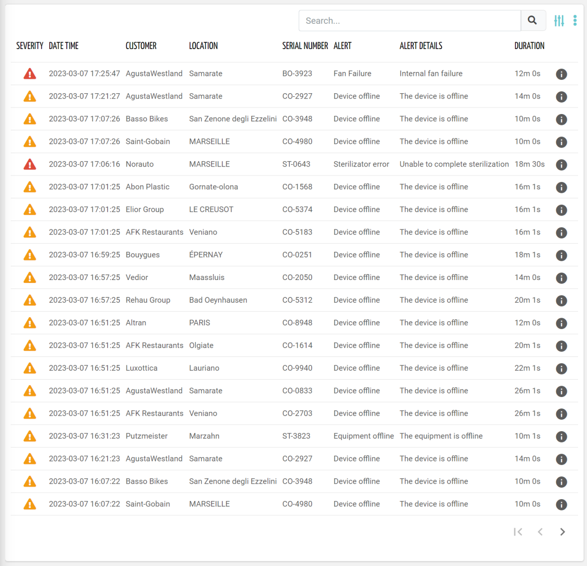
By clicking on the details icon to the right of each alert, the details of the selected alert can be accessed.
The details content can be defined in the template associated with the Historical Alert details page under the UI Profile, or directly with the alert definition.
code_blocksDesign View
In the template editor, you can find the Historical Alert List icon 
You can drag the widget into the grid and then configure the following sub-elements according to your needs:

Below are references to the properties that can be configured for this widget.
For more details on how to manage properties, you can refer to this article.

Below are references to the properties that can be configured for this widget.
For more details on how to manage composite parts, you can refer to this article.
code_blocksCode View
Template Syntax
Below you can find some examples of how to use the component within a template.
<historical-alert-list-widget-v2 pageSize="50">
	<property name="severity" [showHeader]="false" filter="severityIcon"></property>
	<property name="date" [label]="'Date Time'"></property>
	<property name="title" [label]="'Alert'"></property>
	<property name="description" [label]="'Alert Details'"></property>
	<property name="duration"></property>
</historical-alert-list-widget-v2>
Component Reference
Here is a comprehensive list of all the elements and properties that can be used to configure the component.
| Historical Alert List <historical-alert-list-widget-v2> | |
|---|---|
| PROPERTIES | |
| CSS Class | The name(s) of the CSS class used to customize the widget layout. Type: STRING | Optional class="my-custom-class" |
| Details Mode | The way the details page is opened when the details icon is clicked. If non the details icon is not present. Type: ENUM | Optional | Values: PAGE
POPUP
NONE
detailsMode="PAGE" |
| Empty Message | The blank message to be displayed in the widget in case no item was found. To manage translations, you can define a label and use the key as the value of the property. Type: STRING | Optional emptyMessage="No customer found" |
| Export Enabled | The boolean flag indicating whether the data export is enabled. Type: BOOLEAN | Optional | Values: true
false
[exportEnabled]="true" |
| Include Sub Things Alerts | The flag indicating whether sub-things alerts must be included when this widget is placed in a thing dashboard. Type: BOOLEAN | Optional | Values: true
false
[includeSubThingsAlerts]="true" |
| Page Size | The number of items to load on each page. Type: INTEGER | Optional | Default: 50 [pageSize]="100" |
| Query | The array of conditions filtering out items. For instance: [query]='[{'property': 'connectionStatus', 'predicate': 'eq', 'value': '1'}]' Predicates: eq, beginsWith, like, notLike, isEmpty, isNotEmpty, gt, gte, lt, lte. Type: QUERY | Optional query="[{'property': 'connectionStatus', 'predicate': 'eq', 'value': '1'}, {...}]" |
| Query Variable | The id of the page's <things-filter-field> used for searching. Type: STRING | Optional queryFieldRef="query-1" |
| Title | The title displayed on the top part of the widget box. Type: STRING | Optional [title]="'Details'" |
| Click On Row Behaviour | The expected behaviour when a row is clicked. Type: ENUM | Optional | Values: OPEN_DETAILS
OPEN_CONTEXT_OBJECT
clickOnRowBehaviour="OPEN_CONTEXT_OBJECT" [DEPRECATED]
|
| SUB-ELEMENTS | |
| Property | The property whose value must be displayed within the alert detail row or box. Multiple | Optional <property name="serialNumber"></property> |
| Composite Part | The composite part whose value must be displayed within the alert detail row or box. Multiple | Optional <composite-part> <property name="name"></property> <property name="severity"></property> </composite-part> |
| Property <property> | |
|---|---|
| PROPERTIES | |
| Column CSS Class | The name(s) of the column CSS class used to customize the table column. Type: COLUMN_CSS | Optional columnClass="my-column-custom-class" |
| Description | The property description. Type: STRING | Optional description="fooBar" |
| Export Only | The boolean flag indicating whether the property value should be included only in the export and not visible within the page. Type: BOOLEAN | Optional | Values: true
false
[exportOnly]="true" |
| Filter | The name of the filter used to transform and display values. Type: FILTER | Optional filter="fooBarFilter" |
| Label | The property alternative label. Type: STRING | Optional label="Temperature" |
| Name | The property whose value must be loaded by the widget. Type: PROPERTY | Required name="serialNumber" |
| Show Header | The flag indicated whether the header is visible. Type: BOOLEAN | Optional | Values: true
false
[showHeader]="true" |
| Visibility Condition | The expression that allows you to reduce the visibility of the element. Type: STRING | Optional *ngIf="getUser().organizationId != null" |
| Composite Part <composite-part> | |||||
|---|---|---|---|---|---|
| PROPERTIES | |||||
| Column CSS Class | The name(s) of the column CSS class used to customize the table column. Type: COLUMN_CSS | Optional columnClass="my-column-custom-class" |
||||
| Description | The composite-part description. Type: STRING | Optional description="fooBar" |
||||
| Filter | The filter applied on the composite-part to transform or display its value. Type: FILTER | Optional filter="fooBarFilter" |
||||
| Label | The label displayed by the widget. Type: STRING | Optional label="fooBar" |
||||
| Name | The composite-part name. Type: STRING | Optional name="fooBar" |
||||
| Show Header | The flag indicated whether the header is visible. Type: BOOLEAN | Optional | Values: true
false
[showHeader]="true" |
||||
| Visibility Condition | The expression that allows you to reduce the visibility of the element. Type: STRING | Optional *ngIf="getUser().organizationId != null" |
||||
| SUB-ELEMENTS | |||||
| Property | The property whose value must be loaded within the composite-part. Multiple | Optional <property name="serialNumber"></property>
|
||||
Comments
0 comments
Please sign in to leave a comment.