
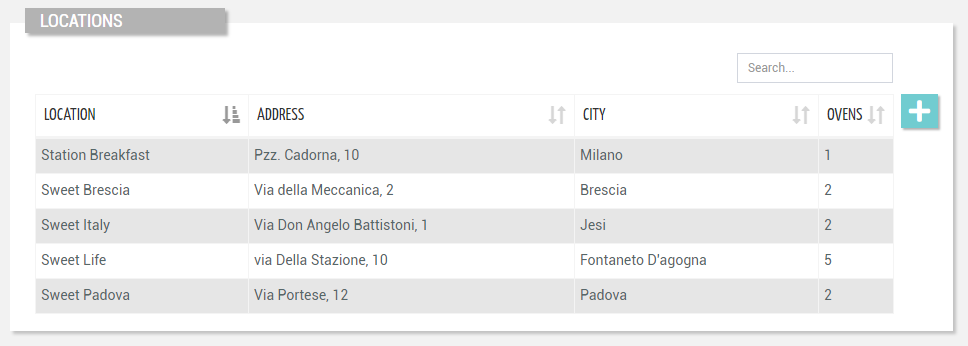
Displays the list of locations visible by the current user and navaigation context.
Other than a simple list, you can specify the Accordion Template, in this way each row can be expanded, and the content is generated by the template having the selected location as input context.
code_blocksDesign View
In the template editor, you can find the Location List icon 
You can drag the widget into the grid and then configure the following sub-elements according to your needs:

Below are references to the properties that can be configured for this widget.
For more details on how to manage properties, you can refer to this article.

Below are references to the properties that can be configured for this widget.
For more details on how to manage composite parts, you can refer to this article.
code_blocksCode View
Template Syntax
Below you can find some examples of how to use the component within a template.
<location-list-widget-v2>
    <property [name]="'name'"></property>
    <property [name]="'properties.address'" [label]="'Address'"></property>
    <property [name]="'properties.city'" [label]="'City'"></property>
    <property [name]="'properties.thingCount'"></property>
</location-list-widget-v2>
Component Reference
Here is a comprehensive list of all the elements and properties that can be used to configure the component.
| Location List <location-list-widget-v2> | |
|---|---|
| PROPERTIES | |
| Accordion Template | The name of the template to show when expanding the accordion for a list row. Type: STRING | Optional accordionTemplate="thing-grid" |
| Actions Enabled | The boolean flag indicating whether actions (e.g. Add button) are enabled on the widget. Type: BOOLEAN | Optional | Values: true false [enableActions]="true" |
| Block Column Span | The number of columns on which to span the properties displayed in each list block (default 1). Type: INTEGER | Optional | Default: 1 [blockColumns]="2" |
| Controls Enabled | The boolean flag indicating whether controls (e.g. Search, Export) are enabled on the widget. Type: BOOLEAN | Optional | Values: true false [controlsEnabled]="true" |
| CSS Class | The name(s) of the CSS class used to customize the widget layout. Type: STRING | Optional class="my-custom-class" |
| Details Path | The path to navigate when a row is clicked. Type: STRING | Optional detailsPath="customer-productivity" |
| Empty Message | The blank message to be displayed in the widget in case no item was found. To manage translations, you can define a label and use the key as the value of the property. Type: STRING | Optional emptyMessage="No customer found" |
| Initial Sorting | The array of property names and criteria to use for sorting (e.g. ['name','asc','serialNumber','desc']). Type: SORT_PROPERTIES | Optional sort="['name','asc','serialNumber','desc']" |
| Page Size | The number of items to load on each page. Type: INTEGER | Optional | Default: 50 [pageSize]="100" |
| Query | The array of conditions filtering out items. For instance: [query]='[{'property': 'connectionStatus', 'predicate': 'eq', 'value': '1'}]' Predicates: eq, beginsWith, like, notLike, isEmpty, isNotEmpty, gt, gte, lt, lte. Type: QUERY | Optional query="[{'property': 'connectionStatus', 'predicate': 'eq', 'value': '1'}, {...}]" |
| Search Fields | The array of fields used to filter out the objects when searching by a generic key. For instance: [searchFields]='['name', 'serialNumber', 'customer.name', 'customer.code']' Type: PROPERTY_ARRAY | Optional searchFields="['name', 'serialNumber']" |
| Title | The title displayed on the top part of the widget box. Type: STRING | Optional [title]="'Details'" |
| Visibility Condition | The expression that allows you to reduce the visibility of the element. Type: STRING | Optional *ngIf="getUser().organizationId != null" |
| SUB-ELEMENTS | |
| Property | The property whose label and current value must be rendered as a widget row. Multiple | Optional <property name="serialNumber"></property> |
| Composite Part | The widget part combining multiple properties. Multiple | Optional <composite-part> <metric name="Temperature"></metric> <metric name="Humidity"></metric> <property name="properties.type"></property> </composite-part> |
| Property <property> | |
|---|---|
| PROPERTIES | |
| Column CSS Class | The name(s) of the column CSS class used to customize the table column. Type: COLUMN_CSS | Optional columnClass="my-column-custom-class" |
| Filter | The name of the filter used to transform and display values. Type: FILTER | Multiple value | Optional filter="fooBarFilter" |
| Label | The property alternative label. Type: STRING | Optional label="Temperature" |
| Name | The property whose value must be loaded by the widget. Type: PROPERTY | Required name="serialNumber" |
| Show Header | The flag indicated whether the header is visible. Type: BOOLEAN | Optional | Values: true false [showHeader]="true" |
| Visibility Condition | The expression that allows you to reduce the visibility of the element. Type: STRING | Optional *ngIf="getUser().organizationId != null" |
| Composite Part <composite-part> | |||||
|---|---|---|---|---|---|
| PROPERTIES | |||||
| Column CSS Class | The name(s) of the column CSS class used to customize the table column. Type: COLUMN_CSS | Optional columnClass="my-column-custom-class" |
||||
| Filter | The filter applied on the composite-part to transform or display its value. Type: FILTER | Optional filter="fooBarFilter" |
||||
| Label | The label displayed by the widget. Type: STRING | Optional label="fooBar" |
||||
| Name | The composite-part name. Type: STRING | Optional name="fooBar" |
||||
| Show Header | The flag indicated whether the header is visible. Type: BOOLEAN | Optional | Values: true false [showHeader]="true" |
||||
| Sorting Criteria | The comma seprated list of property names and criteria to use for sorting the list column associated to this composite-part (e.g. properties.p1,ASC,properties.p2,DESC). Type: STRING | Optional sortingCriteria="properties.p1,ASC,properties.p2,DESC" |
||||
| Visibility Condition | The expression that allows you to reduce the visibility of the element. Type: STRING | Optional *ngIf="getUser().organizationId != null" |
||||
| SUB-ELEMENTS | |||||
| Metric | The metric whose value must be loaded within the composite-part. Multiple | Optional <metric name="Temperature"></metric>
|
||||
| Property | The property whose value must be loaded within the composite-part. Multiple | Optional <property name="serialNumber"></property>
|
||||
Comments
0 comments
Please sign in to leave a comment.