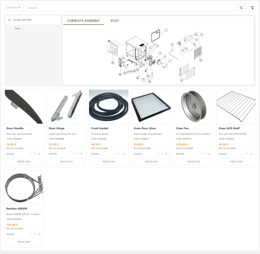
Displays the catalog with spare parts for a specific product model.
This widget must be placed in the thing dashboard, for example, in a tab called Spare Parts. The list of spare parts is automatically filtered by the thing in the navigation context, and so by its product model. This facilitates the search for spare parts by the user, who many times cannot identify the exact model of his product.

The default layout of this widget is a grid of tabs, but in case you do not have images for catalog items, or the user is not interested in images, you can switch to a simple list view.
Configuration
code_blocksDesign View
In the template editor, you can find the Catalog icon 
code_blocksCode View
Template Syntax
Below you can find some examples of how to use the component within a template.
<catalog-widget title="Spare Parts" layoutMode="LIST"></catalog-widget>
Component Reference
Here is a comprehensive list of all the elements and properties that can be used to configure the component.
| Catalog <catalog-widget> | |
|---|---|
| PROPERTIES | |
| CSS Class | The name(s) of the CSS class used to customize the widget layout. Type: STRING | Optional class="my-custom-class" |
| Layout Mode | The layout mode used to display elements in the catalog. Type: ENUM | Optional | Values: LIST
GRID
layoutMode="LIST" |
| Title | The title displayed on the top part of the widget box. Type: STRING | Optional [title]="'Details'" |
| Visibility Condition | The expression that allows you to reduce the visibility of the element. Type: STRING | Optional *ngIf="getUser().organizationId != null" |

Comments
0 comments
Please sign in to leave a comment.