
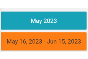
Displays the reference period of the page data in a box.
Configuration
code_blocksDesign View
In the template editor, you can find the Period Details icon 
code_blocksCode View
Component Reference
Here is a comprehensive list of all the elements and properties that can be used to configure the component.
| Period Details <period-details-widget> | |
|---|---|
| PROPERTIES | |
| Background Class | Type: STRING | Optional | Default: bg-info [config]="{bgClass: 'fooBar'}" |
| CSS Class | The name(s) of the CSS class used to customize the widget layout. Type: STRING | Optional class="my-custom-class" |
| Default Loading Period | The default date and time filtering period applied when entering the page. Type: ENUM | Optional | Values: TODAY YESTERDAY LAST_1_HOUR LAST_4_HOURS LAST_6_HOURS LAST_12_HOURS LAST_24_HOURS LAST_7_DAYS LAST_30_DAYS THIS_MONTH LAST_MONTH LAST_6_MONTHS LAST_12_MONTHS THIS_WEEK LAST_WEEK LAST_FULL_7_DAYS LAST_FULL_30_DAYS LAST_FULL_12_MONTHS [config]="{defaultPeriod: 'LAST_7_DAYS'}" |
| Period Variable | The id of the page's variable providing the date range filtering period, for instance the id of a <period-filter-field>. Type: STRING | Optional [inputs]="{period: 'period'}" |
| Title | The title displayed on the top part of the widget box. Type: STRING | Optional [title]="'Details'" |
| Visibility Condition | The expression that allows you to reduce the visibility of the element. Type: STRING | Optional *ngIf="getUser().organizationId != null" |
Comments
0 comments
Please sign in to leave a comment.