
Displays a list of all noteworthy events that have occurred or that are still active.
The widget is aware of the page context, and so can load events over multiple customers, locations and machines.
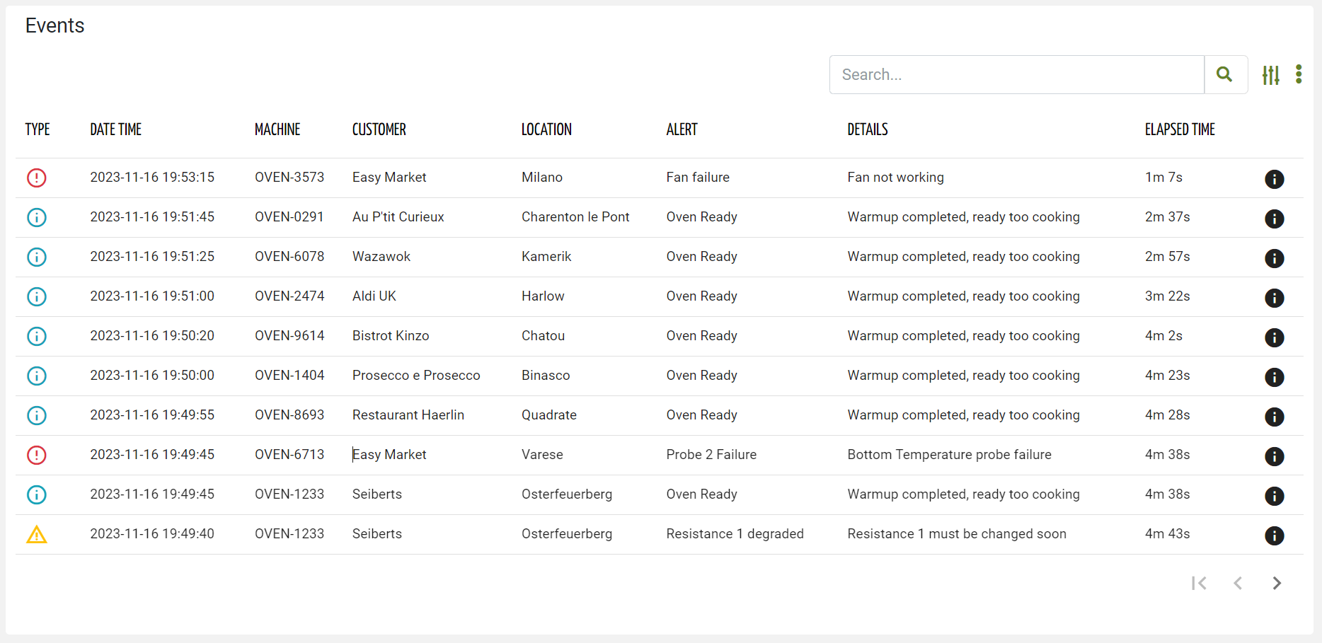
When placed in a page, you must choose whether to show events that are finished and therefore historical, or show events that are still active. By changing the Event Status property you select whether active or historical events must be displayed. If the Event Status property is left blank, the widget will allow selecting whether to display the active or historical events.
The advanced search allows filtering events by:
- Text Key: text which is searched into the name, title and description of each event.
- Customer: a customer can be selected, in the case of a user belonging to an organization or partner.
- Severity: the severity of the event, one of Failure, Major Anomaly, Minor Anomaly and Operation.
- Period: the time period used to filter events by start timestamp.
- Thing Definition or Product Model: one or more thing definitions or product models.
- Type: type of event, choosing one or more definitions.
By clicking the Export button, all events that meet the search criteria can be downloaded through a CSV file.
User Reported Events
User reported events can be created by clicking on the 3-dots icon and the Report Event.
A popup request the user to select the event to register, and optionally provide some additional notes for technicians.
Configuration
code_blocksDesign View
In the template editor, you can find the Event List icon 
You can drag the widget into the grid and then configure the following sub-elements according to your needs:

Below are references to the properties that can be configured for this widget.
For more details on how to manage properties, you can refer to this article.

Below are references to the properties that can be configured for this widget.
For more details on how to manage composite parts, you can refer to this article.
code_blocksCode View
Template Syntax
Below you can find some examples of how to use the component within a template.
<event-list-widget [pageSize]="10" [title]="'Events'">

	<property name="eventSeverity" label="Type" filter="eventSeverity"></property>

	<property name="date" [label]="'Date Time'"></property>
	<property name="thing.serialNumber" label="Thing"></property>

	<property [name]="'customer.name'" [label]="'Customer'" *ngIf="getUser()?.organizationId || getUser()?.partnerId"></property>
    <property [name]="'location.name'" [label]="'Location'"></property>

	<property name="title" [label]="'Alert'"></property>
	<property name="description" [label]="'Details'"></property>
	<property name="duration" [label]="'Elapsed Time'"></property>

</event-list-widget>
Component Reference
Here is a comprehensive list of all the elements and properties that can be used to configure the component.
| Event List <event-list-widget> | |
|---|---|
| PROPERTIES | |
| Controls Enabled | The boolean flag indicating whether controls (e.g. Search, Export) are enabled on the widget. Type: BOOLEAN | Optional | Values: true
false
[controlsEnabled]="true" |
| CSS Class | The name(s) of the CSS class used to customize the widget layout. Type: STRING | Optional class="my-custom-class" |
| Details Mode | The way the alert details is opened if in a POPUP, in a dedicated PAGE or NONE to disable details. Type: ENUM | Optional | Values: POPUP
PAGE
NONE
detailsMode="PAGE" |
| Empty Message | The blank message to be displayed in the widget in case no item was found. To manage translations, you can define a label and use the key as the value of the property. Type: STRING | Optional emptyMessage="No customer found" |
| Event Status | The status of the event to display. Type: ENUM | Optional | Values: ACTIVE
CLOSED
status="CLOSED" |
| Export Enabled | The boolean flag indicating whether the data export is enabled. Type: BOOLEAN | Optional | Values: true
false
[exportEnabled]="true" |
| Include Sub Things Events | The flag indicating whether sub-things events must be included when this widget is placed in a thing dashboard. Type: BOOLEAN | Optional | Values: true
false
[includeSubThingsEvents]="true" |
| Initial Sorting | The array of property names and criteria to use for sorting (e.g. ['name','asc','serialNumber','desc']). Type: SORT_PROPERTIES | Optional sort="['name','asc','serialNumber','desc']" |
| Page Size | The number of items to load on each page. Type: INTEGER | Optional | Default: 50 [pageSize]="100" |
| Query | The array of conditions filtering out items. For instance: [query]='[{'property': 'connectionStatus', 'predicate': 'eq', 'value': '1'}]' Predicates: eq, beginsWith, like, notLike, isEmpty, isNotEmpty, gt, gte, lt, lte. Type: QUERY | Optional query="[{'property': 'connectionStatus', 'predicate': 'eq', 'value': '1'}, {...}]" |
| Query Variable | The id of the page's <things-filter-field> used for searching. Type: STRING | Optional queryFieldRef="query-1" |
| Title | The title displayed on the top part of the widget box. Type: STRING | Optional [title]="'Details'" |
| Click On Row Behaviour | The expected behaviour when a row is clicked. Type: ENUM | Optional | Values: OPEN_DETAILS
OPEN_CONTEXT_OBJECT
clickOnRowBehaviour="OPEN_CONTEXT_OBJECT" [DEPRECATED]
|
| SUB-ELEMENTS | |
| Property | The property whose value must be displayed for each event row. Multiple | Optional <property name="serialNumber"></property> |
| Composite Part | The composite part whose value must be displayed within the event row. Multiple | Optional <composite-part> <property name="name"></property> <property name="severity"></property> </composite-part> |
| Property <property> | |
|---|---|
| PROPERTIES | |
| Column CSS Class | The name(s) of the column CSS class used to customize the table column. Type: COLUMN_CSS | Optional columnClass="my-column-custom-class" |
| Description | The property description. Type: STRING | Optional description="fooBar" |
| Export Only | The boolean flag indicating whether the property value should be included only in the export and not visible within the page. Type: BOOLEAN | Optional | Values: true
false
[exportOnly]="true" |
| Filter | The name of the filter used to transform and display values. Type: FILTER | Optional filter="fooBarFilter" |
| Label | The property alternative label. Type: STRING | Optional label="Temperature" |
| Name | The property whose value must be loaded by the widget. Type: PROPERTY | Required name="serialNumber" |
| Show Header | The flag indicated whether the header is visible. Type: BOOLEAN | Optional | Values: true
false
[showHeader]="true" |
| Visibility Condition | The expression that allows you to reduce the visibility of the element. Type: STRING | Optional *ngIf="getUser().organizationId != null" |
| Composite Part <composite-part> | |||||
|---|---|---|---|---|---|
| PROPERTIES | |||||
| Column CSS Class | The name(s) of the column CSS class used to customize the table column. Type: COLUMN_CSS | Optional columnClass="my-column-custom-class" |
||||
| Description | The composite-part description. Type: STRING | Optional description="fooBar" |
||||
| Filter | The filter applied on the composite-part to transform or display its value. Type: FILTER | Optional filter="fooBarFilter" |
||||
| Label | The label displayed by the widget. Type: STRING | Optional label="fooBar" |
||||
| Name | The composite-part name. Type: STRING | Optional name="fooBar" |
||||
| Show Header | The flag indicated whether the header is visible. Type: BOOLEAN | Optional | Values: true
false
[showHeader]="true" |
||||
| Visibility Condition | The expression that allows you to reduce the visibility of the element. Type: STRING | Optional *ngIf="getUser().organizationId != null" |
||||
| SUB-ELEMENTS | |||||
| Property | The property whose value must be loaded within the composite-part. Multiple | Optional <property name="serialNumber"></property>
|
||||
Comments
0 comments
Please sign in to leave a comment.