
Loads a Calendly scheduling page directly in your DPS.
With this widget, you can easily provide your users with a shared calendar where they can book a support meeting.
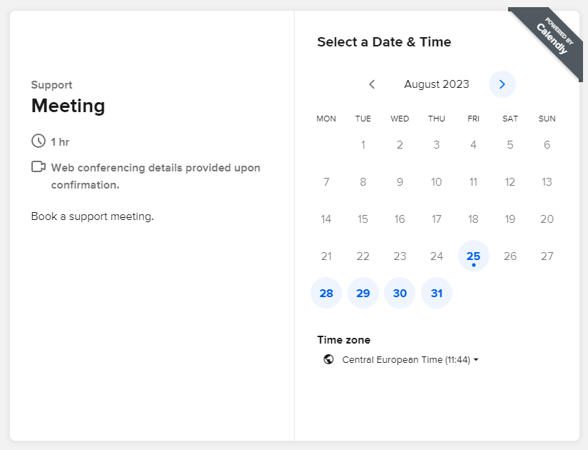
By selecting the day, you can specify the time slot, and finally you can leave notes about the scheduled event.
Configuration
code_blocksDesign View
In the template editor, you can find the Calendly icon 
code_blocksCode View
Template Syntax
Below you can find some examples of how to use the component within a template.
<calendly-widget calendlyUrlPath="my-calendly-path" calendlyName="my-calendly-name"></calendly-widget>
Component Reference
Here is a comprehensive list of all the elements and properties that can be used to configure the component.
| Calendly <calendly-widget> | |
|---|---|
| PROPERTIES | |
| Calendly Name | The name of the calendar to embed, if missing, the user must select the target one. Type: STRING | Optional calendlyName="fooBar" |
| Calendly URL Path | The ULR Path of the calendly being embedded (https://calendly.com/<PATH>). Type: STRING | Optional calendlyUrlPath="fooBar" |
| CSS Class | The name(s) of the CSS class used to customize the widget layout. Type: STRING | Optional class="my-custom-class" |
| Visibility Condition | The expression that allows you to reduce the visibility of the element. Type: STRING | Optional *ngIf="getUser().organizationId != null" |
Comments
0 comments
Please sign in to leave a comment.