
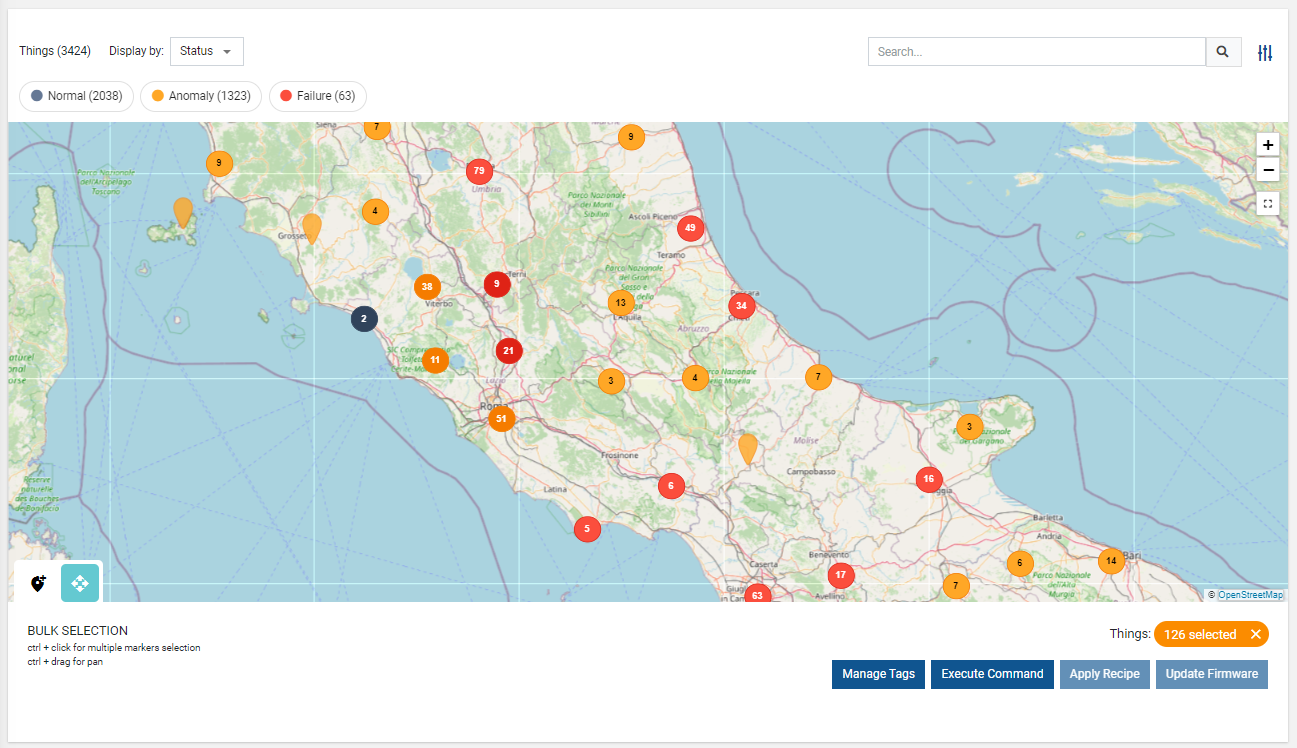
Displays a map with a marker for each geolocated thing or location.
Note that in order to display at least one marker on the map, at least one thing or location must specify the GPS position.
You can add properties to the widget to configure the content of the popup displayed when you move the cursor over a marker. Each property can be overwritten, defining the label, unit and filter.
In addition, you can configure the Map Filters used to highlight markers based on status or other properties (e.g. connection status).
By default, the map offers these selectable map filters:
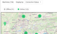
- Connection Status: highlights markers based on the connection status of each thing. In the case of locations, it only needs one thing online for the entire location to be marked as online.
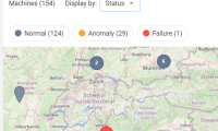
- Status: highlights markers based on the presence of active failures or anomalies.
Note that, by default the map displays markers by using the Connection Status filter, and other Map Filters must be manually added to the widget as sub-elements in the template editor.
By selecting multiple markers (), the widget displays the bulk operations panel, which allows to:
- Manage Tags: select/deselect and edit tags.
- Execute Command: for each identified thing-definition, select a command with bulk support to execute.
- Apply Recipe: select a recipe and apply it to the selected thing.
- Update Firmware: select a firmware and apply it to the selected thing.
Configuration
code_blocksDesign View
In the template editor, you can find the Map icon 
You can drag the widget into the grid and then configure the following sub-elements according to your needs:

Below are references to the properties that can be configured for this widget.
For more details on how to manage properties, you can refer to this article.

Below are references to the properties that can be configured for this widget.
For more details on how to manage composite parts, you can refer to this article.

Below are references to the properties that can be configured for this widget.
code_blocksCode View
Template Syntax
Below you can find some examples of how to use the component within a template.
<map-widget context="THINGS|LOCATION"
            [title]="'Thing Map'"
            [moveElementEnabled]="true"
            [bulkControlsEnabled]="true"
            [queryFieldRef]=""
            [query]="[{..},{..}]"
            maxClusterRadius="30"
            disableClusteringAtZoomLevel="19"
            maxZoomLevel="20"
            mapLayerUrl="https://{s}.tile.openstreetmap.org/{z}/{x}/{y}.png"
            tooltipDetailsFilter=""
            tooltipClass="my-tooltip"
            class="my-map-class">

    <property name="name"></property>
    <property name="serialNumber"></property>
    <property name="connectionStatus" filter="connectionStatus"></property>

    <map-filter name="connectionStatus"></map-filter>
    <map-filter name="status"></map-filter>

</map-widget>
Component Reference
Here is a comprehensive list of all the elements and properties that can be used to configure the component.
| Map <map-widget> | |
|---|---|
| PROPERTIES | |
| Bulk Controls Enabled | The boolean flag indicating whether bulk selection and buttons (e.g. Tagging, Firmware Update) are enabled on the widget. Type: BOOLEAN | Optional | Values: true
false
[bulkControlsEnabled]="true" |
| Cluster Max Radius | The maximum radius that a cluster will cover from the central marker (in pixels). Decreasing will make more, smaller clusters. Type: INTEGER | Optional | Default: 80 [maxClusterRadius]="20" |
| Clustering Max Zoom Level | The zoom level after which clustering is disabled. Type: INTEGER | Optional | Default: 19 [disableClusteringAtZoomLevel]="10" |
| Context | The type of objects to be loaded within the map. Type: ENUM | Optional | Values: THINGS
LOCATIONS
context="LOCATIONS" |
| CSS Class | The name(s) of the CSS class used to customize the widget layout. Type: STRING | Optional class="my-custom-class" |
| Map Layer URL | The URL used to load map layer tiles. You can refer to this page https://leaflet-extras.github.io/leaflet-providers/preview Type: STRING | Optional mapLayerUrl="https://{s}.tile.openstreetmap.org/{z}/{x}/{y}.png" |
| Max Zoom Level | The maximum zoom level of the map. Type: INTEGER | Optional | Default: 19 [maxZoomLevel]="10" |
| Move Tool Enabled | The boolean flag indicating whether the element move tool is enabled. Type: BOOLEAN | Optional | Values: true
false
[moveElementEnabled]="true" |
| Query | The array of conditions filtering out items. For instance: [query]='[{'property': 'connectionStatus', 'predicate': 'eq', 'value': '1'}]' Predicates: eq, beginsWith, like, notLike, isEmpty, isNotEmpty, gt, gte, lt, lte. Type: QUERY | Optional query="[{'property': 'connectionStatus', 'predicate': 'eq', 'value': '1'}, {...}]" |
| Query Variable | The id of the page's <things-filter-field> used for searching. Type: STRING | Optional queryFieldRef="query-1" |
| Refresh Interval | The map refresh interval. Type: STRING | Optional | Default: PT300S refreshInterval="fooBar" |
| Show Hierarchy Enabled | The boolean flag indicating whether the show thing hierarchy is enabled. Type: BOOLEAN | Optional | Values: true
false
[showHierarchyEnabled]="true" |
| Title | The title displayed on the top part of the widget box. Type: STRING | Optional [title]="'Details'" |
| Tooltip CSS Class | The name(s) of the CSS class used to customize the marker tooltip. Type: STRING | Optional tooltipClass="fooBar" |
| Tooltip Details Filter | The name of the filter you can use to customize the marker tooltip. Type: FILTER | Optional tooltipDetailsFilter="FILTER" |
| Visibility Condition | The expression that allows you to reduce the visibility of the element. Type: STRING | Optional *ngIf="getUser().organizationId != null" |
| SUB-ELEMENTS | |
| Property | The property whose label and value must be displayed within the marker tooltip. Multiple | Optional <property name="serialNumber"></property> |
| Composite Part | The composite part whose label and value must be displayed within the marker tooltip. Multiple | Optional <composite-part> <metric name="Temperature"></metric> <metric name="Humidity"></metric> <property name="properties.type"></property> </composite-part> |
| Map Filter | This element allows defining map markers filtering tools. Multiple | Optional <map-filter></map-filter> |
| Property <property> | |
|---|---|
| PROPERTIES | |
| Filter | The name of the filter used to transform and display values. Type: FILTER | Optional filter="fooBarFilter" |
| Label | The property alternative label. Type: STRING | Optional label="Temperature" |
| Name | The property whose value must be loaded by the widget. Type: PROPERTY | Required name="serialNumber" |
| Visibility Condition | The expression that allows you to reduce the visibility of the element. Type: STRING | Optional *ngIf="getUser().organizationId != null" |
| Composite Part <composite-part> | |||||
|---|---|---|---|---|---|
| PROPERTIES | |||||
| Filter | The filter applied on the composite-part to transform or display its value. Type: FILTER | Optional filter="fooBarFilter" |
||||
| Label | The label displayed by the widget. Type: STRING | Optional label="fooBar" |
||||
| Name | The composite-part name. Type: STRING | Optional name="fooBar" |
||||
| Visibility Condition | The expression that allows you to reduce the visibility of the element. Type: STRING | Optional *ngIf="getUser().organizationId != null" |
||||
| SUB-ELEMENTS | |||||
| Metric | The metric whose value must be loaded within the composite-part. Multiple | Optional <metric name="Temperature"></metric>
|
||||
| Property | The property whose value must be loaded within the composite-part. Multiple | Optional <property name="serialNumber"></property>
|
||||
| Map Filter <map-filter> | |
|---|---|
| PROPERTIES | |
| Filter | The filter used to highlight map markers according to a property value, connection status or health status. Type: FILTER | Optional name="fooBarFilter" |
| Label | The optional map filter label; if missing, the default name is used. Type: STRING | Optional [config]="{label: 'Online/Offline'}" |
Filters
The set of filters provided in bundle with this component.
| ConnectionStatusMapFilter | |||||
|---|---|---|---|---|---|
|
Displays the map markers according to the underlying connection status (ONLINE, OFFLINE). Output Type: MAP_FILTER ConnectionStatusMapFilter:{'preselectedStates': ONLINE}
|
 |
||||
| StatusMapFilter | |||||
|---|---|---|---|---|---|
|
Displays the map markers according to the underlying presence of failures or anomalies. Output Type: MAP_FILTER StatusMapFilter:{'preselectedStates': FAILURE}
|
 |
||||
Comments
0 comments
Please sign in to leave a comment.