
This field provides the generic search input, which can be customized by defining the search inputs.
Configuration
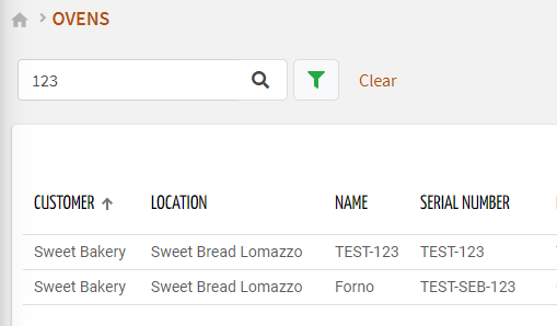
code_blocksDesign View
In the template editor, you can find the Search Field icon 
You can drag the control into the grid and then configure the following sub-elements according to your needs:

Below are references to the properties that can be configured for this widget.
code_blocksCode View
Template Syntax
Below you can find some examples of how to use the component within a template.
<search-field searchTarget="THINGS" id="query-1">
   <search-input type="ADVANCED"></search-input>
   <search-input type="KEY"></search-input>
   <search-input type="PROPERTY" property="property.size"></search-input>
   <search-input type="CLEAR"></search-input>
</search-field>
Component Reference
Here is a comprehensive list of all the elements and properties that can be used to configure the component.
| Search Field <search-field> | |
|---|---|
| PROPERTIES | |
| CSS Class | The name(s) of the CSS class used to customize the widget layout. Type: STRING | Optional class="my-custom-class" |
| Id | The id used by other page widgets to retrieve the query, and update the data in case the query is changed. Type: STRING | Required id="fooBar" |
| Label | The field label. Type: STRING | Optional label="fooBar" |
| Query | The array of conditions filtering out items. For instance: [query]='[{'property': 'connectionStatus', 'predicate': 'eq', 'value': '1'}]' Predicates: eq, beginsWith, like, notLike, isEmpty, isNotEmpty, gt, gte, lt, lte. Type: JSON | Optional [query]="[{'property': 'connectionStatus', 'predicate': 'eq', 'value': '1'}, {...}]" |
| Search Target | The objects to be researched. The advanced search UI depends on the selected target. Type: ENUM | Required | Values: THINGS LOCATIONS CUSTOMERS PARTNERS ACTIONS ACTIVE_ALERTS HISTORICAL_ALERTS searchTarget="CUSTOMERS" |
| Visibility Condition | The expression that allows you to reduce the visibility of the element. Type: STRING | Optional *ngIf="getUser().organizationId != null" |
| SUB-ELEMENTS | |
| Search Input | The sub-element used to customize the search UI. Multiple | Required <search-input type="PROPERTY" property="serialNumber"></search-input> |
| Search Input <search-input> | |
|---|---|
| PROPERTIES | |
| Input Type | The type of input to be displayed as part of the search field. Type: ENUM | Required | Values: ADVANCED KEY PROPERTY CLEAR type="PROPERTY" |
| Name | The property for which to show the search field inline. It can only be used for input of type PROPERTY. Type: PROPERTY | Required property="serialNumber" |
Comments
0 comments
Please sign in to leave a comment.