
This field allows provide a numeric value as page input.
code_blocksDesign View
In the template editor, you can find the Number Field icon 
code_blocksCode View
Template Syntax
Below you can find some examples of how to use the component within a template.
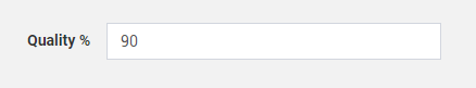
Number field from 0 to 100, with increment step 10 and initial value 90.
<number-field name="quality"
              label="Quality"
              min="0"
              max="100"
              step="10"
              value="90"
              [mandatory]="true">
</number-field>
Component Reference
Here is a comprehensive list of all the elements and properties that can be used to configure the component.
| Number Field <number-field> | |
|---|---|
| PROPERTIES | |
| CSS Class | The name(s) of the CSS class used to customize the widget layout. Type: STRING | Optional class="my-custom-class" |
| Label | The field label. Type: STRING | Optional label="fooBar" |
| Label Position | The position of the label respect the number input field. Type: ENUM | Optional | Values: none left top labelPosition="top" |
| Mandatory | The flag indicating whether the field value is mandatory. Type: BOOLEAN | Optional | Values: true false [mandatory]="true" |
| Max | The field maximum valid value. Type: INTEGER | Optional [max]="123" |
| Min | The field minimum valid value. Type: INTEGER | Optional [min]="123" |
| Name | The name used to reference the input field. Type: STRING | Optional name="fooBar" |
| Property | The name of the thing property used to save the input value (optional). Type: PROPERTY | Optional property="PROPERTY" |
| Step | The minimum value increment step. Type: FLOAT | Optional step="FLOAT" |
| Value | The initial value. Type: FLOAT | Optional value="FLOAT" |
| Visibility Condition | The expression that allows you to reduce the visibility of the element. Type: STRING | Optional *ngIf="getUser().organizationId != null" |
Comments
0 comments
Please sign in to leave a comment.