
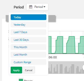
This field allows selecting a period for data filtering.
code_blocksDesign View
In the template editor, you can find the Period Field icon 
code_blocksCode View
Template Syntax
Below you can find some examples of how to use the component within a template.
<period-field id="my-period" opensOption="right"></period-field>
Component Reference
Here is a comprehensive list of all the elements and properties that can be used to configure the component.
| Period Field <period-field> | |
|---|---|
| PROPERTIES | |
| CSS Class | The name(s) of the CSS class used to customize the widget layout. Type: STRING | Optional class="my-custom-class" |
| Default Loading Period | The default date and time filtering period applied when entering the page. Type: ENUM | Optional | Values: TODAY
YESTERDAY
LAST_1_HOUR
LAST_6_HOURS
LAST_12_HOURS
LAST_24_HOURS
LAST_7_DAYS
LAST_30_DAYS
THIS_MONTH
LAST_MONTH
LAST_6_MONTHS
LAST_12_MONTHS
THIS_WEEK
LAST_WEEK
LAST_FULL_7_DAYS
LAST_FULL_30_DAYS
LAST_FULL_12_MONTHS
defaultPeriodValue="LAST_7_DAYS" |
| Enabled Periods | The list of periods which can be selected from the embedded period filter. Type: ENUM_ARRAY | Optional | Values: TODAY
YESTERDAY
LAST_1_HOUR
LAST_6_HOURS
LAST_12_HOURS
LAST_24_HOURS
LAST_7_DAYS
LAST_30_DAYS
THIS_MONTH
LAST_MONTH
LAST_6_MONTHS
LAST_12_MONTHS
THIS_WEEK
LAST_WEEK
LAST_FULL_7_DAYS
LAST_FULL_30_DAYS
LAST_FULL_12_MONTHS
CUSTOM
[periods]="['V1', 'V2', 'VN']" |
| End Variable | The name of the context variable holding the selected period end date. Type: STRING | Optional endVariable="endTime" |
| Id | The id used by other page widgets to retrieve the selected period, and update the data in case the period is changed. Type: STRING | Required | Default: period id="fooBar" |
| Label | The field label. Type: STRING | Optional label="Period" |
| Popup Opening Option | The position where the selection menu is opened (left, center, right [default]). Type: ENUM | Optional | Values: left
center
right
opensOption="center" |
| Start Variable | The name of the context variable holding the selected period start date. Type: STRING | Optional startVariable="startTime" |
| Visibility Condition | The expression that allows you to reduce the visibility of the element. Type: STRING | Optional *ngIf="getUser().organizationId != null" |
| Name | The name used by other page widgets to retrieve the selected period, and update the data in case the period is changed. Type: STRING | Optional name="fooBar" [DEPRECATED] Use the Id property.
|
Comments
0 comments
Please sign in to leave a comment.