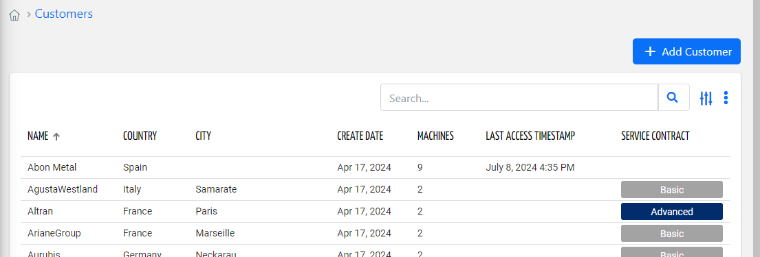
Provides a global add button in the page.

In the presence of this component, the standard buttons embedded into other page widgets (e.g. Customer List) are discarded.
By using the "floating-rounded-button" CSS class, for mobile app you can display a button floating on the list bottom.
Configuration
code_blocksDesign View
In the template editor, you can find the Add Button icon 
code_blocksCode View
Template Syntax
Below you can find some examples of how to use the component within a template.
<!-- Add thing button -->
<add-button icon="add" label="Add Thing" resource="THING"></add-button>

<!-- Add customer button floating on the page bottom for mobile apps -->
<add-button icon="add" class="floating-rounded-button" label="" resource="CUSTOMER" *ngIf="isMobile()"></add-button>
Component Reference
Here is a comprehensive list of all the elements and properties that can be used to configure the component.
| Add Button <add-button> | |
|---|---|
| PROPERTIES | |
| CSS Class | The name(s) of the CSS class used to customize the widget layout. Type: STRING | Optional class="my-custom-class" |
| Icon | The Angular Material icon displayed inside the add button (e.g. add). Type: STRING | Optional icon="fas fa-thermometer" |
| Label | The label displayed inside the add button. Type: STRING | Optional label="fooBar" |
| Resource | The resource on which to create the new object. Type: ENUM | Required | Values: THING
LOCATION
CUSTOMER
PARTNER
TAG
resource="LOCATION" |
| Tooltip | The tooltip displayed over the add button. Type: STRING | Optional tooltip="fooBar" |
| Visibility Condition | The expression that allows you to reduce the visibility of the element. Type: STRING | Optional *ngIf="getUser().organizationId != null" |

Comments
0 comments
Please sign in to leave a comment.