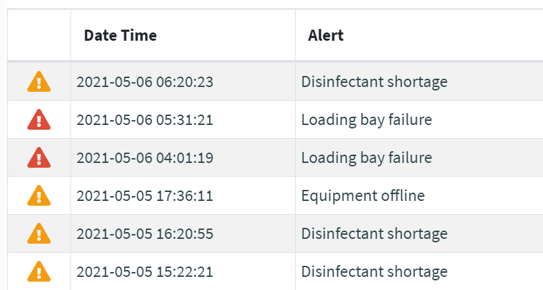
A filter printing a colored icon by a given value.
How it works
This filter and its variants can be applied to metrics and properties template elements.
The string case is ignored (e.g. "Critical" -> "CRITICAL").
In case of null or empty values no icon is printed.
In case the value has not been registered within the options, the value itself is printed as it is.
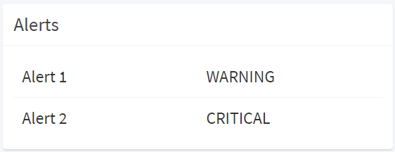
Without this filter, the values of metrics/properties are printed as they are according to the underlying value type, for instance:
Filter Variants
The set of predefined filter variants that can be used to format values.
| severityIcon | |
|---|---|
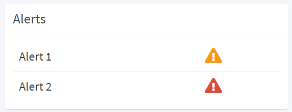
| Prints out an icon according to the a severity string (eg. WARNING, FAILURE). Supported Input Types: INTEGER | FLOAT | NUMBER | STRING Output Type: HTML |
|
| thresholdIcon | |
|---|---|
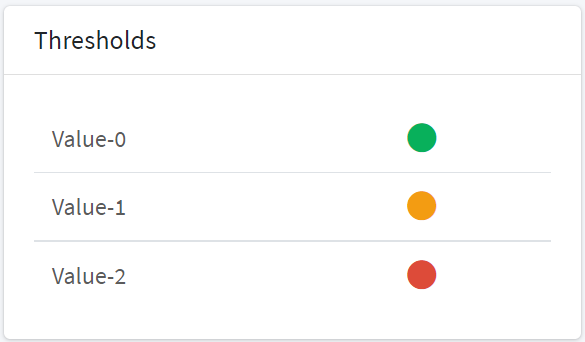
| Prints out a circle whose color depends on a numeric threshold (<50 green, >=50 and <75 orange, >=75 red). Supported Input Types: INTEGER | FLOAT | NUMBER | STRING Output Type: HTML |
|
| thresholdIcon2 | |
|---|---|
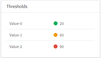
| Prints out the value with a circle whose color depends on a numeric threshold (<50 green, >=50 and <75 orange, >=75 red). Supported Input Types: INTEGER | FLOAT | NUMBER | STRING Output Type: HTML |
|
Configuration Options
New variants can be defined through the following configuration options.
| Option | Description | Sample Value |
|---|---|---|
| iconStyle | The style to apply to the printed icon. | font-size:20px;text-align:center |
| fallback | The fallback icon in case of unrecognized value. | icon='fas fa-exclamation-triangle' |
| showValue | The flag indicating whether to display the value after the icon. | true |
| thresholds | The optional array of THRESHOLD objects used to convert a numeric value to a specific severity. | 'thresholds':[{...},{...}] |
| unit | The optional measurement of unit displayed within the icon title. | °C |
| <VALUE_KEY> | For each possible value the set of properties used to render the value. | 'fooBar':{...} |
VALUE_KEY
Each
| Property | Description | Sample Value |
| icon | The Font Awesome icon to be displayed. | fas fa-exclamation-triangle |
| color | The icon color. | #f39c12 |
THRESHOLD
The properties of the threshold object to be added in the thresholds array.
| Property | Description | Sample Value |
| min | The lover exclusive threshold. | 50 |
| max | The upper inclusive threshold. | 75 |
| severity | The result severity (one of |
WARNING |
Example of custom filter variants:
// icon by value
exports.severityIcon = ValueToIcon({
"INFORMATIONAL": { "icon": "fas fa-info-circle", "color": "#08b05b" },
"WARNING": { "icon": "fas fa-exclamation-triangle", "color": "#f39c12" },
"CRITICAL": { "icon": "fas fa-exclamation-triangle", "color": "#dd4b39" },
"FAILURE": { "icon": "fas fa-exclamation-triangle", "color": "#dd4b39" },
"EMERGENCY": { "icon": "fas fa-exclamation-circle", "color": "#FF0000" }
});


// icon by value with thresholds
exports.thresholdIcon = ValueToIcon({
"thresholds": [
{ "max": 50, "severity": "NORMAL" },
{ "min": 50, "max": 75, "severity": "WARNING" },
{ "min": 75, "severity": "CRITICAL" }],
"NORMAL": { "icon": "fas fa-circle", "color": "#08b05b" },
"WARNING": { "icon": "fas fa-circle", "color": "#f39c12" },
"CRITICAL": { "icon": "fas fa-circle", "color": "#dd4b39" }
});

Comments
0 comments
Please sign in to leave a comment.