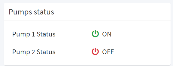
Displays boolean values in different ways, for example through colored labels, or icons.

How it works
This filter and its variants can be applied to metrics and properties template elements.
Depending on the type, the filter input value is automatically converted to a boolean and then displayed according to the selected variant options.
| Value Type | Expected True Values | Expected False Values |
|---|---|---|
| BOOLEAN | true | false |
| INTEGER | 1 | 0 |
| STRING | "true", "1", "yes" | "false", "0", "no" |
The string case is ignored (e.g. "True" -> true).
Null or empty values are always handled as false.
Without this filter, the values of metrics/properties are printed as they are according to the underlying value type, for instance:

Filter Variants
The set of predefined filter variants that can be used to format values.
| greenGrayLed | |
|---|---|
| Converts the boolean value into a GREEN or GRAY led. Supported Input Types: BOOLEAN | STRING | INTEGER Output Type: HTML |

|
| greenRedCircle | |
|---|---|
| Converts the boolean value into a GREEN or RED circle. Supported Input Types: BOOLEAN | STRING | INTEGER Output Type: HTML |

|
| okError | |
|---|---|
| Converts the boolean value into a colored Ok or ERROR text. Supported Input Types: BOOLEAN | STRING | INTEGER Output Type: HTML |

|
| okErrorBadge | |
|---|---|
| Converts the boolean value into a colored Ok or ERROR badge. Supported Input Types: BOOLEAN | STRING | INTEGER Output Type: HTML |

|
| onOffIcon | |
|---|---|
| Converts the boolean value into a POWER-ON or POWER-OFF icon with status text. Supported Input Types: BOOLEAN | STRING | INTEGER Output Type: HTML |

|
| redGrayCircle | |
|---|---|
| Converts the boolean value into a RED or GRAY circle. Supported Input Types: BOOLEAN | STRING | INTEGER Output Type: HTML |

|
| redGrayLed | |
|---|---|
| Converts the boolean value into a RED or GRAY led. Supported Input Types: BOOLEAN | STRING | INTEGER Output Type: HTML |

|
| yesNo | |
|---|---|
| Converts the boolean value into a colored YES or NO text. Supported Input Types: BOOLEAN | STRING | INTEGER Output Type: HTML |

|
| yesNoBadge | |
|---|---|
| Converts the boolean value into a colored YES or NO badge. Supported Input Types: BOOLEAN | STRING | INTEGER Output Type: HTML |

|
Configuration Options
New variants can be defined through the following configuration options.
| Option | Description | Sample Value |
|---|---|---|
| trueText | The text to be displayed when true (default null). If unspecified no text is displayed. | Yes |
| falseText | The text to be displayed when false (default null). If unspecified no text is displayed. | No |
| trueIcon | The Font Awesome icon to be displayed when true (default null). If unspecified no icon is displayed. | fas fa-circle |
| falseIcon | The Font Awesome icon to be displayed when false (default null). If unspecified no icon is displayed. | fas fa-square |
| trueColor | The color code to be used for text, icon or badge coloring when true (default #28A745). | #007F0E, green |
| falseColor | The color code to be used for text, icon or badge coloring when false (default #DC3545). | #FF0000, red |
| badge | The flag indicating whether to display a colored badge (default false). | true |
| led | The flag indicating whether to display a colored shadow under the icon (default false) to simulate a led light. | true |
Javascript Code
Example of defining a custom boolean filter variant:
exports.fooBarBoolean = BooleanFormatter({ "trueText": "FOO", "falseText": "BAR"});

Comments
0 comments
Please sign in to leave a comment.